Danish Pastel: What Is It & How Can You Use It In Your Home?

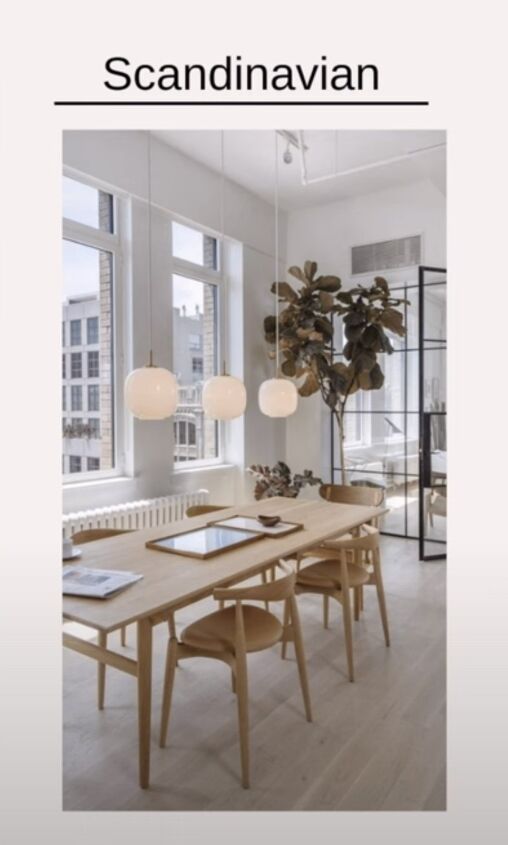
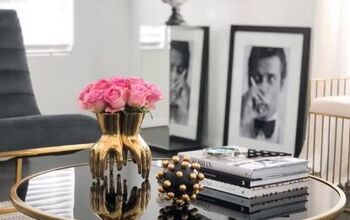
Danish Pastel is new in the world of Scandinavian design. You may have noticed a change in the Scandinavian design of late in that the color schemes, which are usually thoughtfully planned with clean lines, are beginning to take a backseat. We now see more soft, frilly rugs, playful shapes, and bolder uses of color.
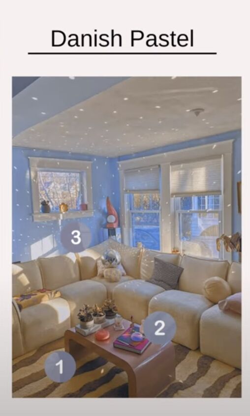
Danish Pastel
What is Danish Pastel?
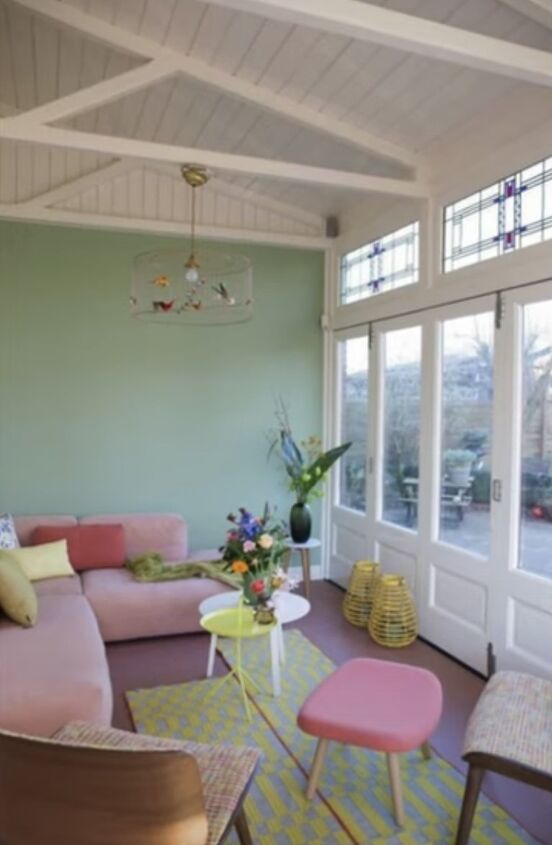
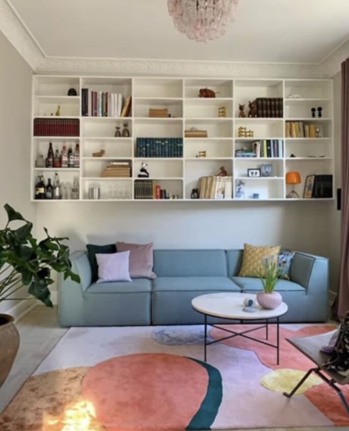
While it's true that neutral walls may still be present in Danish pastel this is not always the case. Now, you are just as likely to see a peach or a pretty wall in a room featuring a seafoam green couch as well as a plush mint rug.
Danish Pastel is shifting Scandinavian design in new and colorful ways. It really brightens up the mood with the combination of both cozy hygge and a playful pastel palette.
I think that this shift towards softer and brighter colors is a great way to spruce up your interior design as we move to spring and beyond.
Blending designs
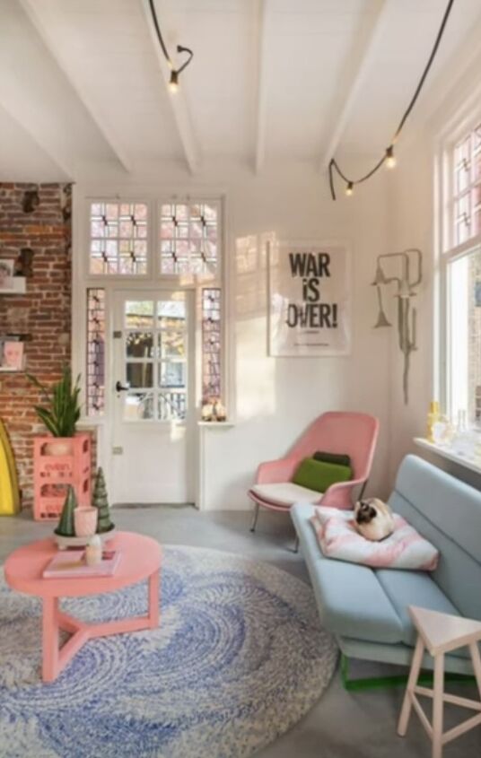
Try blending Danish Pastel with hygge and the Swedish form of lagoon, which means just enough within your interior design. This can create a calm and cheerful environment, fostering a positive mood. Danish Pastel embraces many of the typical qualities of Scandinavian design.
You will still see an emphasis on the quality of craftsmanship in home decor items, but what is also present is the uncluttered open room design.
The ideology of having a calm and inviting space remains the goal, as is the use of natural light. Where Danish Pastel separates itself is in how much color is present. It is a Scandinavian design but with a serious pastel boost.
Fresh splashes of bright tinted hues in a neutral room leap to the eye and really allow every last bit of natural light to be reflected and illuminate the space. The usage of pastels is a wonderful way to soothe your senses and trigger a sense of happiness. It is spring-like and rejuvenating and it really injects you with a sense of energy and a refreshed view of life.
Relaxing and calm
Pastels foster a feeling of relaxation and calm when used in interior design. The tinted hues also tend to promote a very cheery attitude. These qualities make it easy to understand why this design style is taking the design world by storm. Who could not use a little bit more calm and cheer in their life now? I know I could use some.
What better way to start adding more bright colors to your home than now, as the season is about to change from the bright summery feeling to the dark long nights? One of the great things about Danish Pastel is that it is easy to start practicing in your home.
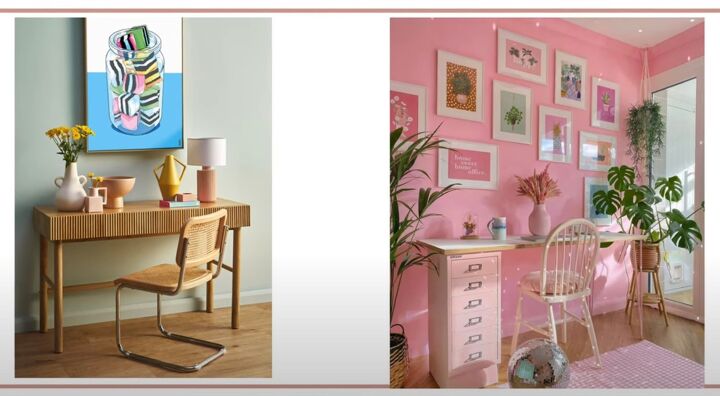
Pastels make great accent colors when paired with neutrals or dark hues in interior design. When used in this manner, they really provide balance and a complex sophistication to your color scheme. They also look terrific when paired with other colors within the same family.
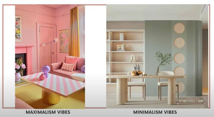
Danish Pastel and minimalism or maximalism
Another great feature of Danish pastel is that it works equally well in a minimalist or maximalist interior design style. In case you have ever Googled, can you be a colorful minimalist? I'm here to tell you that the answer is yes, you can.
Pare your space to only what is essential, but you can paint those walls lilac, and then you can add a beautiful peach couch. It will look fabulous. Try to aim for functionality over harsh minimalism to maintain a sense of comfort and calm within your home.
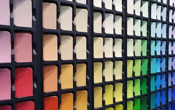
Pastel colors
Pistachio Green
Pistachio green is my number one absolute favorite pastel color to use in interior design. The psychology of green in its fully saturated form evokes relationships with nature, ideas, and renewal.
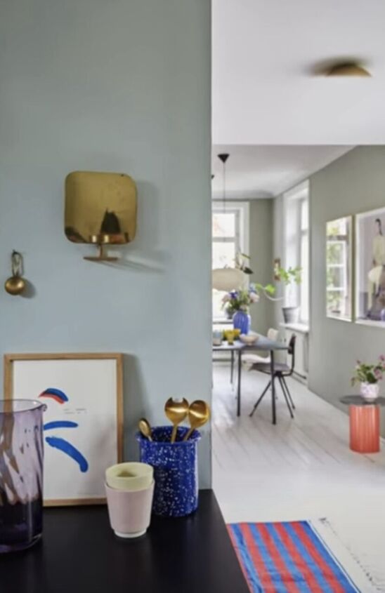
The use of green with white then creates a fresher, crispier view that holds the same traits but also fosters a sense of serenity.
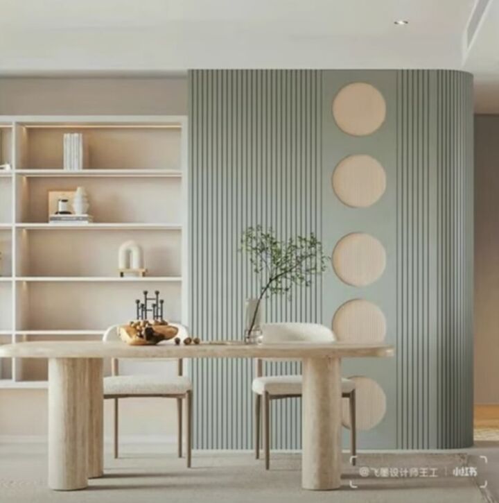
Pistachio Green is especially helpful when used in an environment intended to promote calm and optimism.
One great way to incorporate this color is in your kitchen. An idea would be to add a pistachio green spoon rest to your kitchen as an accessory to inspire a little bit of joy while cooking and nourish yourself and your loved ones.
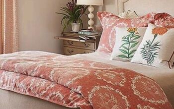
Pink
Pink is another terrific pastel color to use in interior design.
Although its parent color, red, is extremely aggressive, the tinted hue is non-threatening, and it fosters feelings of optimism, hope, and innocence. Just close your eyes and remember that feeling you get when you first see some beautiful pink flowers during springtime, you know, after a dark and cold winter. There is really a positivity to pastel pink that cannot be denied.
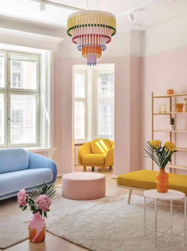
Try adding it to your living room or even to your bedroom. I really love the idea of some sheer pink curtains because they filter in light beautifully, and the entire room is bathed in a nice soft rose tint.
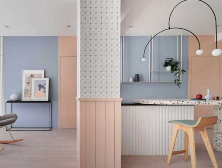
Powder Blue
The final color that I would like to mention is Powder Blue.
Blues have a natural tendency to evoke feelings like calm, stability, as well as imagination. Pastel varieties such as Powder Blue also foster associations with open spaces, inspiration, and sensitivity. Imagine gazing up at the sky on a cloudless day during a beautiful summer day. You can let your imagination go, and it can take you places.
Powder Blue is a great addition to your living room or craft room. It can also invigorate you when you wake up in the morning if used in a bedroom.
Danish Pastel
Do you use the Danish Pastel style in your decor? What colors do you use? Share your ideas and inspiration in the comments below.
Comments
Join the conversation