Pro Design Tips: Choosing Paint Colors
Have you ever picked out the perfect paint color at the paint store, only to get it home and on the walls, and it's not what you wanted? Picking out paint colors can be a daunting task sometimes. You want it to be right the first time. And while it is just paint- who wants to repaint a room after you just did it?!? I certainly don't!
Color consultations are something that I do on a regular basis for friends and clients. And I always get the same questions, and run into people making the same mistakes when picking out paint colors. Selecting the perfect paint color isn't some closely guarded secret by Designer's; but there are a few things you need to do, in order to pick the perfect paint color every time. So let's talk paint!

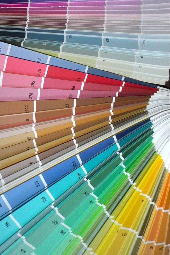
Every room is different, as is the lighting. The fluorescent lighting in the paint store is very different from the lighting in your home, so it's important for you to see the paint color in the space it will be in, before you decide on a color. It's also great to see the color in morning, noon and evening light- since the colors will change slightly with the lighting. Never pick a paint color in the paint store.
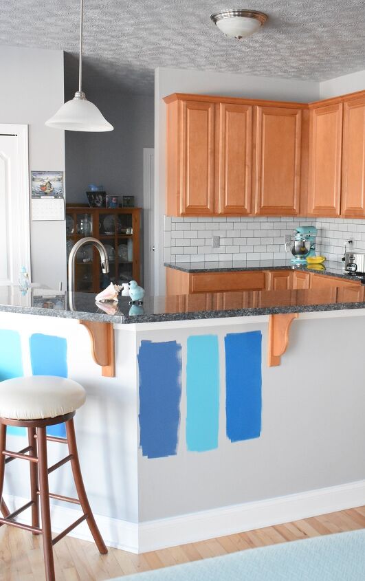
Larger paint chips are available at most paint stores, or you can get a small paint sample to paint a swatch on your wall. I highly recommend you do this! Having a sample of the paint color and/or colors you are considering on your walls for a few days, is a great way to see how you like it in your space. It's also very helpful to place the paint samples next to any wood molding, pictures or furniture that will be up against the paint color, to make sure the color looks right.
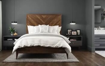
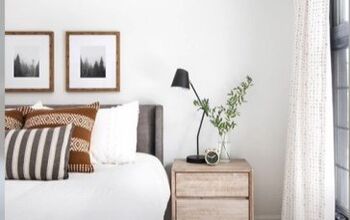
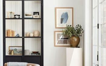
It is important when choosing paint colors to consider how each room will look, when standing and looking into another room. This does not mean you have to paint your whole house one color. But you do need to consider how rooms flow into each other and those spaces connect. For spaces with open floor plans, sometimes this can get tricky on where one room ends and the other begins. In these cases sometimes, using one color for the space is the best option. But however your space is configured, having a color scheme that flows throughout the whole space makes your home feel connected and put together. This doesn't mean that each room needs to look the same. It simply means that the colors you use throughout your main living space, should be found throughout the rest of the home. So for example, you could go with a neutral paint on the walls, and use fabrics and accent pieces to add color to your living room. Then in the bedrooms, you could put one of those colors on the walls and use a more neutral bedding, with pillows in one or two of the other accent colors. The important thing to remember, is that you want the design of your house to flow. You don't want every room to be a completely different style or color than the rest of the space, or your house begins to look more like a museum than a home.
The paint sheen you choose is very important for the look of your walls. The higher the sheen- the more imperfections will be visible on your walls. Here is a quick reference for the different paint sheen's and what they are usually best for:
- Flat or Matte: Has no shine at all- it soaks up, rather than reflects, light. It is great for walls that have something to hide, and for low traffic areas like living rooms and adult bedrooms, as well as ceilings. Not great for little hands though- flat paint shows dirt and hand prints easily. It is also hard to clean without taking the paint off with the grime.
- Eggshell: Has a flat (no-shine) finish with a little luster, like a chicken's egg. Hence the name. It covers wall imperfections well, and is great for living rooms and dining rooms that don't get a lot of traffic.
- Satin: Has a bit more shine/luster to it. It is easy to clean, which makes it excellent for high-traffic areas, like kids bedrooms, family rooms, foyers and hallways. But because of the extra shine it shows applications flaws, such as roller or brush strokes if not applied properly. Flaws in the wall are also a little more noticeable with this sheen.
- Semi-Gloss: Has a more shiny look to it, and reflects the light. It is good for rooms where moisture, drips and grease stains challenge your walls. It's also great for trim work, chair rails, bathrooms and kitchens because it is easy to clean.
- High-Gloss: Has a very shiny luster and really reflects the light in a space. It is the easiest to clean of all the paint sheen's and is very durable. This sheen is a great choice for areas that sticky fingers touch- cabinets, trim and doors. High-gloss, however is too much shine for interior walls and shows every little flaw in the wall. So don't skimp on your prep work if you are using this shiny sheen!
So there you have it- how to pick a paint color like a pro. And even though these steps will add a little more time to the whole process- I promise you it's worth it! So what will you be painting next??


Comments
Join the conversation
I live on a yacht with loads of windows, but usually have the shades down for privacy. For the life of me, I can't find a color I like. I want a light, warm neutral. Don't want to go white. Am sick of light grey. But darker colors make it look too closed in. Most of my art is in the pastel range and I have a chocolate brown sofa and oversized arm chair with hugh ottoman. My other home is painted a light coffee and cream neutral. Any suggestions, please?
Hi Claudia...
I know I’m a bit ‘late to the party’ but, I am just seeing this post.
I found this post on Neutral Shades that might help you narrow down some ideas. I’m not sure if the article will be what ‘pops-up’ first when you go to her website…you'll probably need to do a Search for the article.
Best of Luck!! :)