How to Choose Paint Colors for Your Home Interior: 8 Key Tips

Let's take a look at some ways to use paint to transform the look and feel of your home. Paint is one of the fastest and least expensive ways to give your space a whole new look.
So we will explore how to choose paint colors for your home’s interior that showcase the best architectural features you have.
Remember, home paint color design is an intentional process, but with the tips I am about to share, you will be able to curate home interior paint color ideas that match your taste in no time.
How to choose paint colors for your home
Paint can help you create an overall atmosphere, so the first thing to ask yourself is how you want your space to feel.
Think about the mood you want to create rather than the trends of the moment, which change from year to year. This is big when it comes to discovering how to choose paint colors for your home.
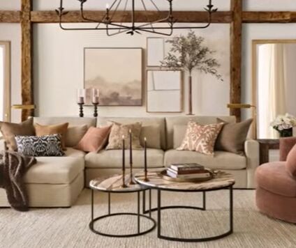
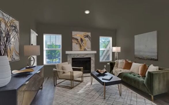
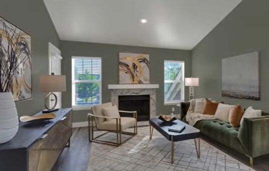
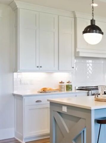
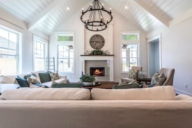
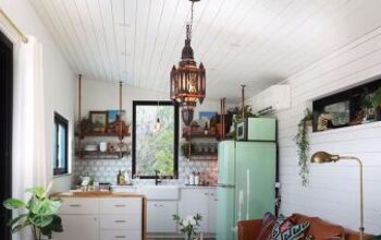
1. Neutrals
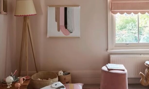
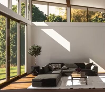
Neutrals are calming colors that are muted or less saturated and are restful to the eye. They can be done in light and airy ways to brighten up any space and make it feel almost ethereal.
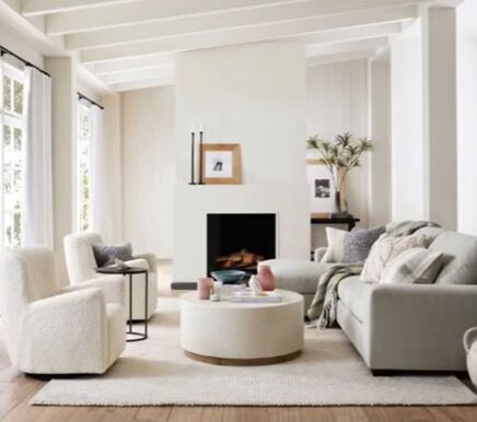
These looks are often created with soft to warm white paint that can be used not only on walls, ceilings, and trim but on cabinetry as well.
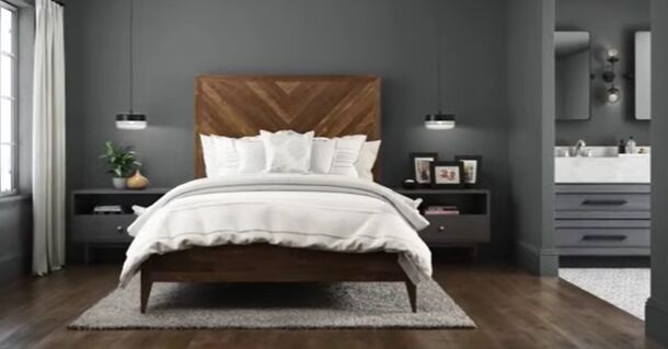
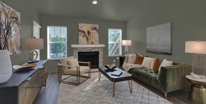
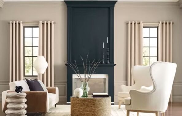
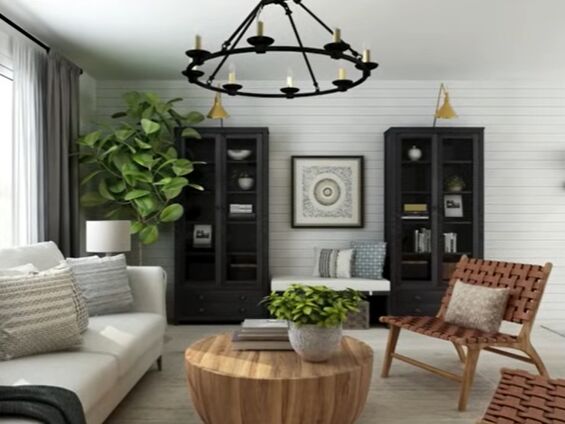
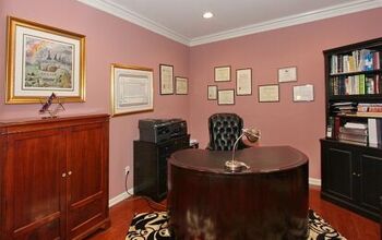
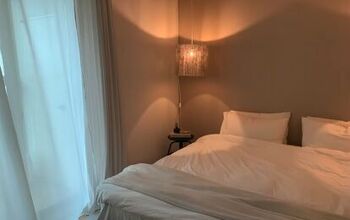
2. Deeper tones
But if you want a relatively light look with a more grounded and intimate feel, you can go with deeper tones to create a calming and natural cocoon of color.
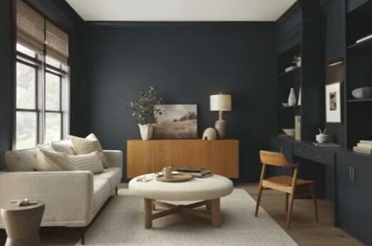
Dark colors add visual weight and depth, creating an intimate atmosphere. Even though they're moody and dramatic, they can also be calming and restful.
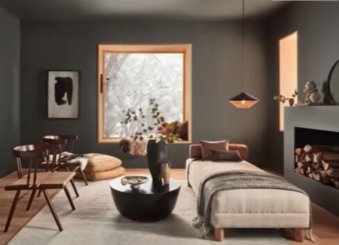
Painting walls and ceilings in the same deep shade will create a cozy and intimate room envelope.
Depending on the particular home, it may not be the best choice for overall paint color but could be a great choice in rooms separated by a door or in semi-enclosed areas.
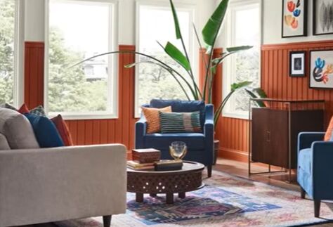
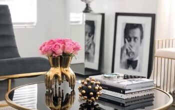
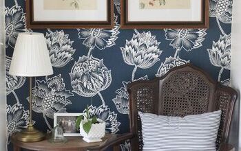
3. Bold colors
Another fun way to go if you want to create spaces that are bold and fun is to go with deeper colors that have retained some of their brightness.
Bolder colors coming from opposite sides of the color wheel will create more visual excitement because of the high contrast.
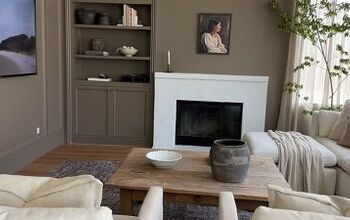
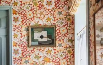
4. Color drenching
But another way to use color, and one that is very on trend right now, is to use color drenching to create that excitement, but in a more cohesive way.
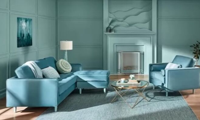
Color drenching consists of choosing a single color and using it throughout a space, even adding furnishings in the same color family.
You can drench a space in soft neutral colors as well, creating visual excitement, but in a softer way.
5. Creating shape
Paint can be used strategically to shape your space.
Using paint that's the same or slightly contrasting in color on walls, ceilings, and trim, whether it's dark or light, establishes continuity and expands the room by blurring the edges of the space.
But if your ceiling color is significantly lighter or darker than your wall color, it creates a line of demarcation so you won't get as spacious of a look.
You can get the illusion of taller ceilings by installing crown molding and painting it the same color as the walls to draw the eye up further or painting the ceiling and any crown moldings in a darker shade than the walls to make it look lower and create a cozy and intimate feel.
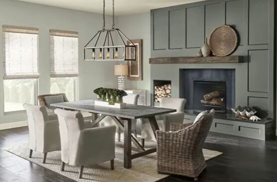
6. Sheen
Sheen is a great way to create a cohesive look while providing just enough contrast to keep things interesting.
This strategy can be used when painting the same or similar colors on ceilings, walls, cabinetry, and trim.
The best paint finish for walls: flat or matte
For walls, flat or matte finishes do a great job of de-emphasizing texture and imperfection and have a soft appearance.
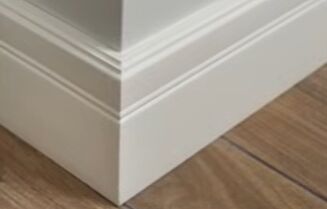
The best paint finish for baseboards and trim: satin or semi-gloss
For baseboards and trim, you can go with satin or semi-gloss depending on your preference for shine.
If you have painted cabinetry, a satin finish is a great choice to help differentiate them from flat or matte walls and coordinate them with the trim.
The best paint finish for ceilings: flat sheen
For ceilings, a flat sheen is best at hiding imperfections and keeping the focus on the floors, walls, and furnishings.
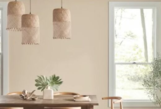
7. Undertones
Undertones are the result of blending more than one color together.
The dominant color is the mass tone or overtone, and it's the color that's perceived. The color you don't see is the undertone, a tint that's added to the paint that gives it warmth or coolness.

8. Light reflectance
The light reflectance value or LRV of a paint lets you know its brightness and how much light it'll reflect.
The scale is from 0 to 100 with 0 being absolute black and 100 being the brightest white. Paints with an LRV of 50 or above will reflect light while those under 50 will absorb it.
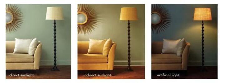
Light plays a huge role in how color is perceived.
North-facing rooms
Natural light from north-facing windows will tend to cast a cool light, make things look more gray or blue, and enhance any cool tones in the room.
South-facing rooms
Light from south-facing windows will cast a warm light, make the room appear more yellow, and enhance any warm tones in the space.
East-facing rooms
With east-facing windows, you get bright soft morning light, but the light turns cooler from midday through the afternoon.
West-facing rooms
West-facing windows will give you more subdued light before noon, and it will get warmer and brighter as the afternoon progresses.
Home paint colors
As you can see, there are a lot of factors that will affect how home paint colors will look in any space, so be sure to get samples and view them in the space you'll use them in at all times of day and in all lighting conditions.
Discovering how to choose paint colors for your home’s interior is a process but one you can master with time.
How do you use paint to shape and transform your home? Let me know in the comments down below.
Disclaimer: I may receive a small affiliate commission from purchases made via links in this article but at no cost to you.
Links
Pottery Barn (affiliate links)
Crate & Barrel (affiliate link)
Paint Manufacturers and Suppliers:


Comments
Join the conversation