Here Are My Controversial Interior Design Opinions: What Are Yours?

Welcome back to another episode where I throw myself into the fire and discuss interior design trends that I don't like.
As always, I just want to remind you that if you like these trends and you have them in your home, or you really want to have them in your home, that is totally fine.
I'm not here to make anyone feel bad about their design choices. They're just simply not for me.

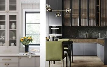
1. Boucle furniture
We all know what boucle is, right? It's that fabric that's made out of looped yarn that has that nubby texture.

It's a fabric that has come in and out of style over the decades, first appearing on iconic furniture and fashion pieces in the 1940s and 50s, namely the boucle womb chair designed by Eero Saarinen in 1948 and the pink boucle jacket designed by Chanel and made famous by Jackie Kennedy.

She was actually wearing it the day JFK was assassinated.


It came back a couple of years ago in a big way, appearing on everything in interiors from sofas and armchairs to throw pillows and more.
I'm sure there are some quality boucle furniture pieces that are lovely.

However, more often than not I've seen very poorly made furniture with a cheap boucle that looks more like a raggedy old bath mat than a nice armchair that I'd want to get cozy in.

2. Limewash paint
Limewash has been on the rise for the past couple of years, and it’s just too much.

It's too mottled. It's too busy. It reminds me of the 90s. And essentially, I think it just looks like you have dirty walls.

Limewash's mottled, shadowy effect shows much less dirt than standard painted surfaces do. And why is that? Because it already looks like it's got dirt on it. This trend is a hard pass for me.

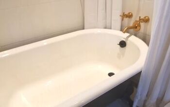
3. Full marble bathrooms
While marble is undeniably beautiful, there are several reasons why I'm not a fan of the full marble bathroom look.

First, it's just way too much of the same thing. I think using marble as an accent or even as a focal point can be really beautiful and elegant.

For example, this marble shower bench combined with white Zellige tiles and the tiny black and white checkerboard tile on the floor is beautiful. It still looks luxurious, and it's interesting.

Or, check out this beautiful shower, which is covered entirely in this gorgeous marble.

When you look at the rest of the bathroom, it's more pared back.

The white trim and light wood tones are all very soft, allowing the marble to really be the star.

Often you'll find that different tones and tile sizes are used to try and keep things interesting, but it's still all just one material.

I think good design should include a variety of materials to create interest, texture, and contrast. Plus, can you imagine the echo?

4. Excessively huge hidden pantries
I've been seeing this kitchen trend that is basically just huge pantries that are actually secret rooms hidden away that you can access by opening what appears to be a kitchen cupboard.

These spaces are basically hidden pantries combined with a scullery kitchen. Today, people are reviving the scullery kitchen in a more modern way and often combining it with a pantry.

You can make these spaces as elaborate as you want to, provided that you can afford it. Essentially, it's a place to hide your kitchen mess.

Initially, I had a big knee-jerk reaction to this trend. I don't live in a big house. I don't have children, I never have to feed large groups of people, and I never have caterers over. But then the more I thought about it, the more it actually made sense to me because, of course, it's not always about me.

If you are lucky enough to have the space to build one of these, they seem like they could be a great addition to a home. On the other hand, it all seems a bit excessive to me.

5. Thick grout lines
I've been seeing this trend rear its ugly head now and then, and every time I see it, I'm like, is this good though?

It's basically subway tiles laid next to each other vertically with no grout in between and then very thick grout between each line of tiles. That's not explaining it very well, but you can see a picture of what I mean. There are other designs as well, but that's the most popular.

I think it's really cool when designers try new things and experiment with new ways of using traditional materials.

I don't think this grout trend will become mainstream, mainly because it's extremely labor-intensive to do it. I don't think the result is even worth the effort.

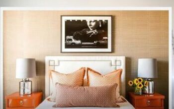
6. TV in the bedroom
Having a TV in the bedroom is a major taboo in the design world. Tech in the bedroom stimulates your brain, and it can delay you from falling asleep.

These things are all true. However, they're not true for me.

Personally, I love having a TV in the bedroom, and it doesn't affect our sleep in the slightest. We actually use Netflix in bed with the intent of falling asleep to it.

We have the TV on a timer, and it shuts off on its own after thirty minutes. By then, we're fast asleep.

Not to mention if you're having a sick day, it's nice to be able to watch something while you're resting.

If there was any kind of tech that I'd ban from the bedroom, it would be the phone, not the TV.
Interior design trends to avoid
I hope you learned something from my take on the interior design trends to avoid this year. While many trends are either loved or hated by some, these interior design trends definitely made it on my no list.
What design trends would you like to see vanish? Share your worst offenders down below.


Comments
Join the conversation