10 Mistakes That Impact Balance in Interior Design & How to Fix Them

Today we're talking about ten interior design mistakes to avoid and what we can do instead to create interesting, balanced, and harmonious spaces. These are design sins that I have personally committed in the past and I still see some of them being committed by interior designers and homeowners today.
So let's talk about what they are and what we can do instead. I'll be presenting some guidelines, but everyone's home is different, so use these as a jumping-off point and do what's best for your home.
Balance in interior design
Balance in interior design
Balance in interior design is important because when things are not in balance, we tend to get thrown off by it. So what is balance in interior design anyway? In essence, it simply means that there is not a single feature in the room that overpowers all others.
In other words, all of the elements of a room are harmonious with one another in terms of their visual weight. To make sure your home stays in this harmonious state, follow the balance principles of interior design and avoid the most common interior design mistakes.
Here are the top ten interior design mistakes to avoid:
1. Not varying heights
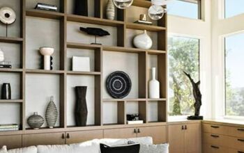
Furniture and decor that's all at the same level lacks interest and makes a space look flat.
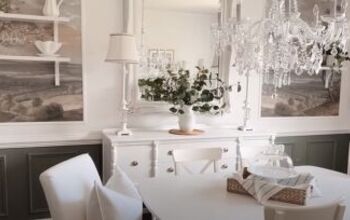
Try to vary the heights of your furniture pieces and add some interest with tall plants, lamps, sconces, floor mirrors, and wall art.
These different height levels will draw your eye around the room and create an interesting and balanced space.
2. Wrong furniture size
The scale of furniture items and how they work together is important.
Use a variety of sizes of furniture, but make sure they're in proportion to each other.
You can also group smaller tables of different heights to get the dimensions right.
3. Rug too small
Area rugs help ground and define a room, adding depth and texture. But an area rug that's too small throws the entire design of the room off making it appear smaller.
Ideally, all the pieces in a living room would fit on top of the rug but at a minimum, the rug needs to be big enough to fit at least all the front legs of the seating plus at least 8 inches on the sides.
A dining room rug should fit the table and chairs and allow space for chairs to be pulled out from the table.
A bedroom rug should extend at least 2 feet on all sides of the bed.
4. Artwork too high
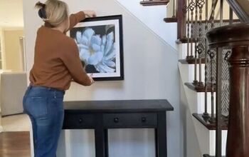
Artwork that's hung too high is difficult to appreciate and will throw off the balance of the room making the piece feel visually disconnected from the space.
A good guideline is to hang art so that the top third of the piece is about 57 inches from the floor. You want to be able to comfortably view the piece when you're standing in front of it.
The 57-inch guideline will work in many cases but here are some guidelines for special placement like above a sofa or headboard.
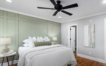
The guideline in these cases is to hang the artwork 8 to 10 inches above the back of the sofa or headboard. This will keep you from bumping the piece and still keep it at a good viewing height.
5. Artwork too small
Artwork that's too small will make the entire room and all the furnishings in it feel like it's out of scale and out of balance. The guideline here is the same as for the sofa coffee table arrangement.
If you're hanging the piece over a sofa, headboard, sideboard, or console table, aim for the piece or group of smaller pieces to be at least 2/3 the length of the furniture it's hanging over to keep everything in proportion.
6. Relying on overhead lighting
Using only overhead lighting can make a room feel harsh, cold, and clinical.
Additional ambient lighting will give your space a relaxed feel to create that cozy ambiance, comfort, and appeal.
Lighting should be layered and should come from a combination of lighting sources at different heights and varying intensities.
In most spaces, I don't recommend overhead lighting at all unless it's in the form of an indirect decorative fixture with low light output, but if you like this type of light, make sure it's on dimmers for a softer look.
7. Wrong color temperature
Harsh white light can make a space feel stark and uninviting.
Choose soft white bulbs with a color temperature of 2700 kelvin for most areas of the home.
Warm lighting not only sets the mood but also makes a room feel cozy and intimate.
You can bump it up to 3000 kelvin bulbs for kitchens, bathrooms, and laundry rooms.
8. Drapery too low
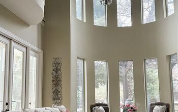
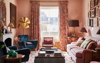
Drapery that's hung too low makes the window feel shorter and the ceiling feel lower.
Raise the rod almost to the ceiling if possible but at least 6 inches above the frame.
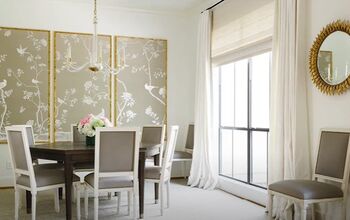
Along the same lines, frame the sides of the window with drapery panels that are wider than the opening. This will also make the window appear larger and add some softness and a touch of elegance to the space.
9. Drapery too short
Although drapery is largely a matter of taste and style, short drapes will make walls and windows appear shorter and give a less elegant look.
For a cozier yet more luxurious feel, drapery should skim the floor and maybe even puddle a bit.
10. Not prioritizing greenery
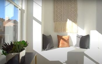
A room without plants or some type of greenery can look barren and empty like something is missing.
Greenery adds height and organic texture to a room creating balance.
Add some indoor plants or trees in your empty corners as well as stems and flowers on your horizontal surfaces to bring in some life.
Balance principles of interior design
I hope learning more about balance in interior design illustrates the design mistakes you are currently making at home. What spaces are still lacking balance where you are? Let me know in the comments below.






Comments
Join the conversation