10 Worst Living Room Design Mistakes & How to Fix Them

Modern living rooms work really hard. You watch TV in them, you eat in them, you read in them, and sometimes you even sleep in them.
They are just that impressive. Unfortunately, there are ten common living room design mistakes that I see time and time again that really should be remedied. I will walk you through each of them today and offer living room design ideas that I actually approve of.
Here are the ten worst living room design mistakes people make at home:
Worst living room design mistakes
1. Letting it all hang out
Open storage is not real storage. It looks cluttered and accumulates a lot of dust over time.
What I would suggest instead is to make the most of the storage in your living room that is behind closed doors.
Only reserve about 20 to 40 percent of storage space as open storage space and use it to display things that look nice but might not be as functional.
2. Messy minimalist
If you're a minimalist and you don't have many pieces of furniture or tables in your living room, it might get messy. I think it's inevitable because we have a lot of things.
That is why you should have side tables next to your armchairs and sofas, coffee tables in the middle of the room, cabinets or shelves behind you, and other places with a flat surface where you can put all of your items.
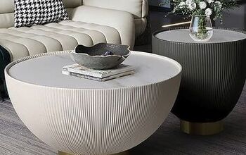
3. Incompatible coffee table
Sometimes your coffee table ends up being a little bit too small, and that makes your room look under-furnished.
Other times, it's a little bit too big, and that makes your room look tiny.
The height of your coffee table should be around the same level as the seat of your sofa or chair so you should aim for a height that ranges from 16 to 24 inches as a general rule.
The coffee table's length should be about 2/4 to 3/4 the length of the sofa.
In terms of width, a coffee table should generally be within the same range as the seat depth of your sofa or chairs or even narrower.
4. Floaters in the room
I see a lot of people who have a rug that is clearly too small for their sofa. This is a definite no-no.
If the rug is too small, it makes the room look smaller, it cheapens the space, and somehow the seating area just doesn't look as cohesive because it's not a real zone.
What you want to do is to always make sure that the front legs of the sofas or armchairs are all on the rug.
5. Match made in hell
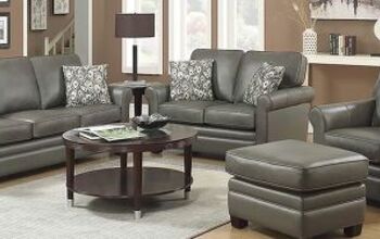
When everything in your space is matching, it looks boring, and a bit outdated.
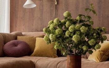
I think space looks much more interesting if at least some of the pieces are not matching, as in they go well together and look cohesive but have different textures, colors, and layers.
6. Creating a dance floor
When planning furniture layout, it's very easy to push everything to the edge of the room by default. But this is not how you should think of furniture placement.
It's not about populating the edge of the space, it's more about the relationship of each piece of furniture next to the others.
So instead of working toward the walls, create conversational seating arrangements. Pull furniture forward into groups that make sense for a connected space.
7. Hating your neck
Another mistake people make is that they hang their TVs at the wrong height. Design is about a lot more than just having a home that looks pretty. Ergonomics should also be taken into consideration.
Your TV should not be hung so high up that you begin to experience neck pain, and you're forced to look up when you want to watch your favorite show. As soon as you start placing it high above the mantel or on a shelf in a really weird location, it no longer becomes useful or practical for you.
Your TV should be at eye level to where you're sitting.
8. Not understanding scale
Having furniture that's too small in a room makes your room look under-furnished, and having furniture that's too big in your room makes your space feel cramped, uncomfortable, and claustrophobic.
If you're one of the fortunate ones who has a large living room, ensure that you leave at least 30 inches in the gaps between the furniture and the wall.
And if you have a smaller apartment, try to leave at least an 18-inch gap between the pieces.
9. Living in the Dark Ages
Another mistake that people make is to have only 1 light source in the living room. The problem with this is that when you switch this 1 light on, your room doesn't look cozy at all. It's also not very functional.
What you should do is aim for about 5 to 7 different light sources in a room at varying heights and in varying zones.
10. Lifeless walls
Another big mistake I see people make a lot is just leaving your walls white and bare.
I think having untreated bare white walls can be very boring and lifeless in homes.
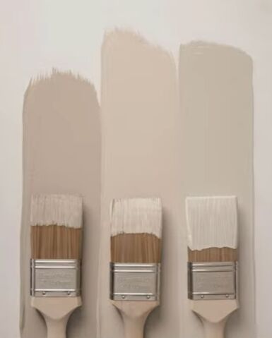
To make a space feel more charming and lived in, it's always nice to have some wall decorations. You can start by softening the walls and painting them a light cream or pastel color instead of stark white.
You can also add some big pieces of artwork, a gallery wall, wallpaper, and moldings.
Living room design ideas
Interior design for a living room doesn’t have to be so complicated. These are the top ten mistakes I see people make again and again, and being familiar with them will help you avoid them.
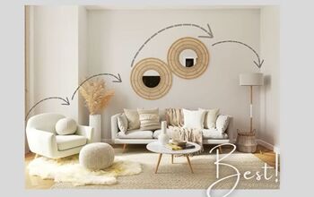
I’ve also shown you some smart living room design ideas that can get you started in creating a space you’ll enjoy for years to come.
What mistakes have you been making and how do you plan to fix them? Share your personal design ideas for a living room down below.










Comments
Join the conversation