How to Choose the Best Warm Neutral Paint Colors For Your Home

We've been moving away from cool colors to warm neutral paint colors for some time now, but we're not headed all the way back to the Tuscan-inspired 2000s. This is a more modern warming that bridges the gap between warm and cool and offers flexibility in creating a balanced and timeless look.
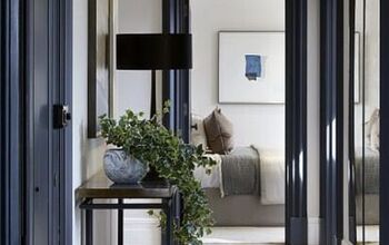
A great way to bridge that gap is to use flexible neutrals that have a good balance of warm and cool. We're talking about off-whites, warm grays, taupes, and soft beiges. So today, we're going to explore creating light and airy looks by going a little deeper in color to create a warm, natural, and relaxed feel.
Table of contents

Here are three things to consider when selecting warm neutral paint colors for living rooms, kitchens, bedrooms, bathrooms, and offices in your home.

Light reflectance value
The light reflectance value, or LRV, of a paint, lets you know how bright it is and how much light it will reflect. The scale is from 0 to 100, with 0 being absolute black and 100 being the brightest white. The higher the LRV value of a paint, the more light it will reflect.

The warm neutrals we're discussing here with LRVs in the 60s and 70s are light, but are richer and offer a more cozy feel than white paints that have a higher LRV.

Undertone
All colors have an undertone and they're most noticeable in light colors. Those that look warmer will have yellow, beige, or pink undertones.

Those with a cooler look will have blue, green, or violet undertones.

A good way to identify a paint's undertone is to compare it against a very bright white. You'll notice they look much deeper than soft white paint colors, and you can see how pairing them with white trim offers a nice contrast.

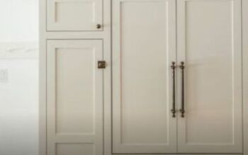
Some great trim colors to get this effect are Benjamin Moore's Chantilly Lace, one of the brightest whites available, or Sherwin-Williams Pure White, which is less bright and gives a more subtle but still very effective contrast.

There are many warm neutrals that have a wide range of undertones, but the ones we're talking about here will focus on the delicate balance between warm and cool.

These colors are light enough to have a soft, almost imperceptible undertone of mostly violet or pink, and how they're perceived will be affected by both natural and artificial light.

Light
Light, both natural and artificial, plays a big role in how color is perceived. The direction your natural light is coming from will have a big effect as will the color temperature of your light bulbs, which lean toward the warmer side.

Light colors with an LRV of 50 or above will reflect light and are the most affected by light and colors in their surroundings.

- Cool light from North-facing windows will enhance cool tones and make the space look more gray or blue.
- Warm light from South-facing windows will enhance warm tones and make the space look more yellow.
- East-facing windows provide a warmer light in the morning and a cooler light in the afternoon.
- West-facing windows do the opposite by providing cooler light in the morning and warm bright light in the afternoon.

The best warm neutral paint colors
There are lots of beautiful warm neutrals available, so use the following as a jumping-off point for your exploration. If a color appeals to you, get a fan deck or a sample card that shows adjacent colors to see if one of them might be an even better fit for you.
Put samples on the walls of each room that you're considering painting and view them at all times of day in natural and artificial light to make sure you're happy with how they look.

1. Sherwin-Williams Heron Plume
The lightest of our Sherwin-Williams warm neutral paint colors with an LRV of 75 is Sherwin-Williams Heron Plume. On its own, it looks like a soft white but when compared to a brighter white, you can see it reads a warm gray. It offers a great balance of warmth and coolness with its subtle violet-pink undertones and creates a soft warm vibe.

2. Sherwin-Williams Aesthetic White
Sherwin-Williams Aesthetic White also looks like a soft white, but it's actually a light grayed-down beige with an LRV of 73 and a subtle touch of violet undertone, which keeps it from skewing to yellow. It reads softly warm against white trim, so it's great for when you want to keep things light and airy but want a bit more depth in color than a soft white.

3. Benjamin Moore's Pale Oak
Benjamin Moore's Pale Oak with an LRV of 69 is a beautiful neutral taupe. With its pink to slightly yellow undertone, this color is a chameleon, reading warm in direct sunlight and soft, warm gray in less direct light. If you don't mind its changeability, pale oak is a great choice to bring in a balance of warm and cool.

4. Benjamin Moore's Balboa Mist
Benjamin Moore's Balboa Mist is a pale warm gray with an LRV of 66. With its subtle violet undertones, this color is also a bit of a chameleon, looking more gray in morning light versus much warmer in afternoon light.

5. Sherwin-Williams Modern Gray
The deepest of our colors is Sherwin-Williams Modern Gray with an LRV of 62. Modern Gray leans taut but is light enough that it can read off-white and bright light. It has a good bit of saturation and contrasts well against white trim.
As a light shade with a subtle pink undertone, it will definitely warm up a room while keeping a light yet cozy look.
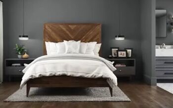
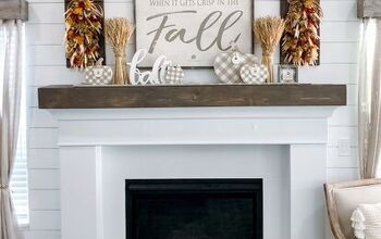
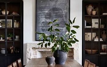
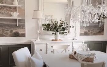
Warm neutral paint colors
Warm neutral paint colors
If you're looking for the best warm neutral paint colors for your home, I hope this gave you some inspiration. I'd love to know what you think of these specific warm neutral paint colors, or if you have any other favorites, like warm neutral paint colors by Dulux. Share your thoughts by commenting down below.


Comments
Join the conversation