The Top Benjamin Moore Paint Colors & How to Use Them

I'm going to share with you some of my favorite Benjamin Moore paint colors. I'm also going to share some tips about choosing paint and tips about painting. I'm hoping they save you both time and money.
Choosing paint colors
Hue and value
The first tip is understanding two simple terminology words accompanying paint, and the first is hue. All hue means is that it is the color. The hue is red, the hue is orange, the hue is black, the hue is purple. That's just the color. The second word is value, which is just how dark or how light that same color is.
Compare hues
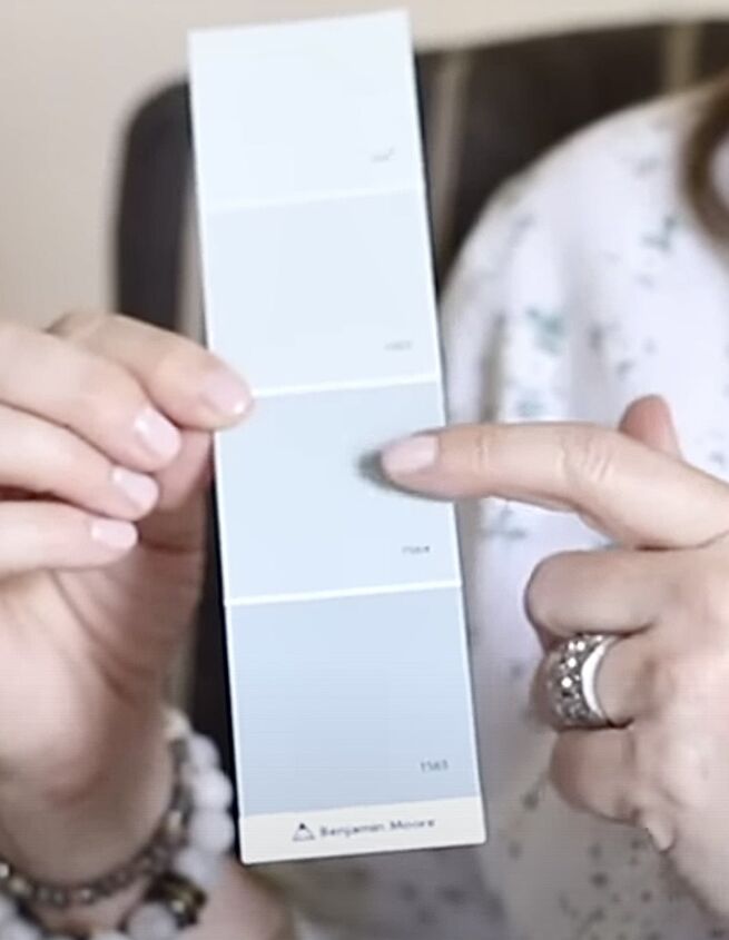
So tip number two is to get several different paint chips and compare. When you're holding one color up, I think that's blue, but if I grab another paint chip color and hold it up to it, I see more green. Compare your hues in different colors.
White paper test
Tip number three is what I call my white paper test. Say I'm working with a client, and they show me this color they like, but they say it looks light. They're really worried it's going to be too light. I pull out a white piece of paper, take that paint chip, and hold it up against that white paper. When looking at the paint color, you can see exactly how dark that paint will look.
Choosing the correct sheen
I do a lot of work for clients who have new builds. Builders will paint an entire house with flat paint, and they do that for two reasons. One, it's a lot cheaper. Two, it hides flaws. I think flat paint should only go on the ceiling because it is very chalky, and you can barely touch it without making a mark.
So if you're somebody getting ready to build new, if you can, upgrade. You'll get charged more, but upgrade to a higher sheen. Many times down the road, my clients are repainting their entire house, and you'll save a ton of money doing that upfront.
For most of the living areas, I like eggshell. It isn't too shiny, and it's effortless to clean. For the bathrooms and kitchen, I chose satin. The sheen is slightly higher, making it a lot easier to clean in those high-traffic areas.
Do not store paint in the original can
When you're done painting a room and have maybe a fourth of the paint left in the gallon can, do not store it in that can. Go to the home improvement store. They sell empty quart cans. Pour the rest of your paint into that quart can. It will seal it and help it last longer.
When you have some marks on the wall a year later and want to touch them up, this is how you do it. If it's been a year or two, even though it's the same paint color, time has gone by, you've dust and dirt on it, and even when you wash it, that paint color changes just a teeny bit so that if you just slap that fresh paint on it, you're going to see it.
You want to pour a little paint out in a little cup.
Add a little bit of water, and then when you go to touch that spot, go around the spot and feather out, and then nobody will see that you touched that paint.
My favorite Benjamin Moore colors
So, let's jump into my favorite colors. I'm going to share with you some of my favorite light blues, medium blues, and dark blues.
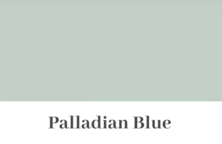
Palladian Blue
My first favorite light blue color is Benjamin Moore's Palladian Blue.
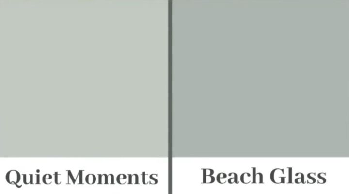
Quiet Moments and Beach Glass
My next two favorites are called Quiet Moments and Beach Glass. They're blue with just a hint of green in them. Absolutely warm and soothing colors.
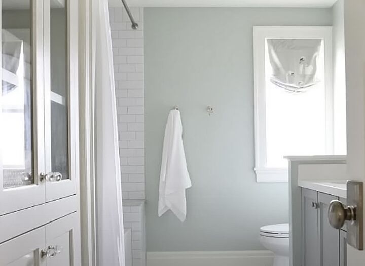
They are great in a laundry room, a guest bathroom, or a guest bedroom.

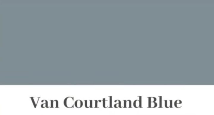
Cloudy Sky and Van Courtland Blue
My favorite medium blue is Cloudy Sky, and my second favorite is Van Courtland Blue. Again, these blues have a hint of gray, so they're not so stark. They're muted.
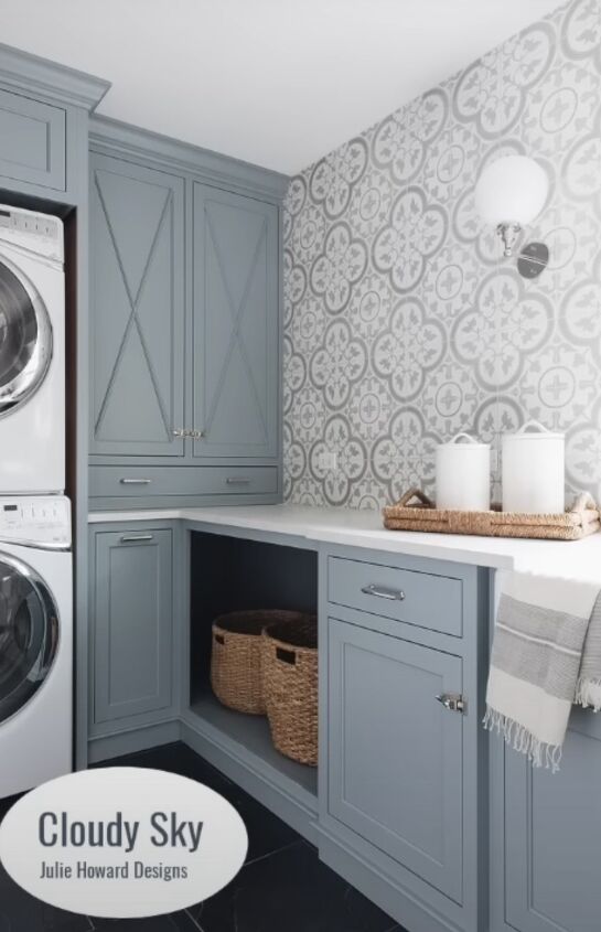
I think you could use them in any room.
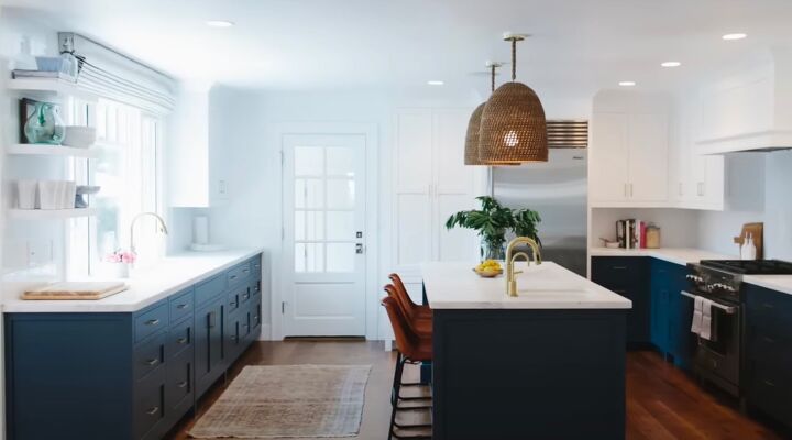
Hale Navy
My favorite very dark blue color is called Hale Navy. It looks great in the kitchen.
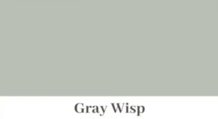
Gray Wisp
Of my favorite green colors, the first one is Gray Wisp. I know it has the word gray in it, but it is a muted green with probably a little gray, so it's not so stark.
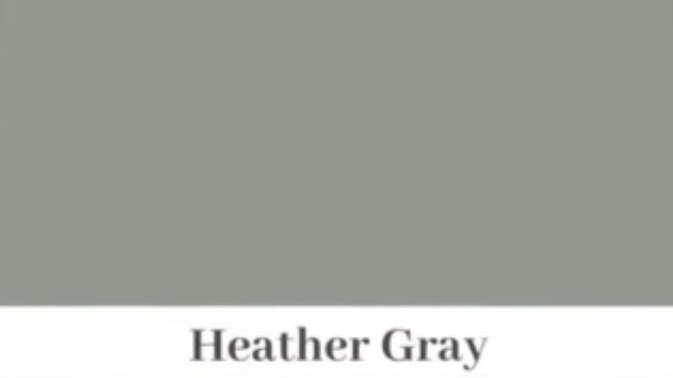
Heather Gray
The second green color I like a lot is called Heather Gray. It's a darker green. This color would look beautiful in a bonus room.
Instead of painting your trim a white or an off-white color, choose one of the black colors. Now for my favorite neutral colors. I'm not going to give you a gray color because I'm trying to give you colors that I think are timeless.
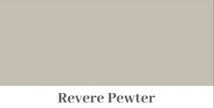
Revere Pewter
Of the three neutral colors I like, my top favorite is Revere Pewter. We have that color in our store, and I chose it because it is a gray-beige color, and when I have furniture in the store, if it's a black piece, it looks great up against that color. If it's a brown piece, it looks great against that color.
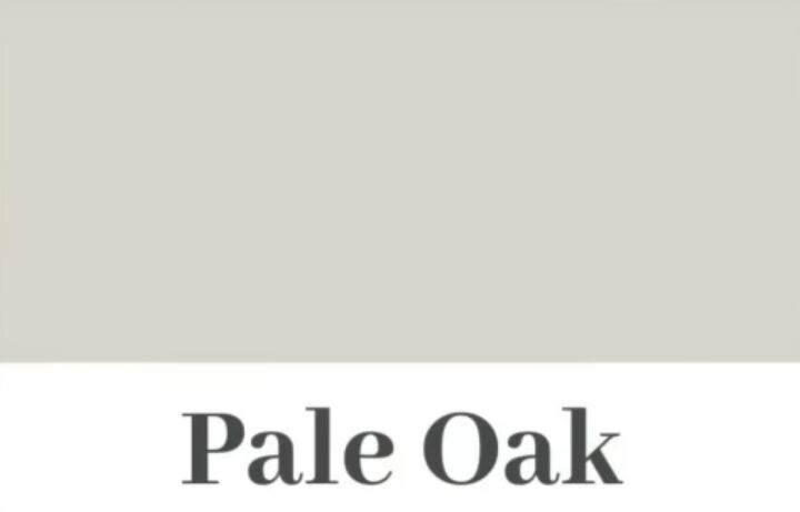
Pale Oak
My second one is pale oak. It's a little lighter than the Revere Pewter. Stunning.
I have that in my bedroom.

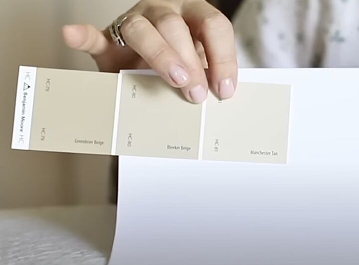
Manchester Tan
My third color, which is one of my favorites, is Manchester Tan. Manchester Tan has no gray in it, so if I have clients with more red or burgundy, Manchester Tan is the color you want to choose.
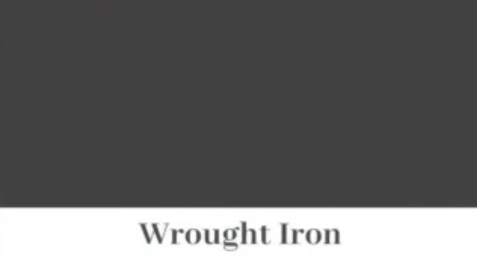
Wrought Iron
For my favorite two black colors, the first is Wrought Iron. It is not a stark black; it is gray-black. It is a beautiful color to paint on interior doors, front doors, shutters, and bookshelves.

Cheating Heart
My second favorite is called Cheating Heart. It is darker than the wrought iron but still not as stark as a regular black. My final favorite paint color I want to share with you is white.

Chantilly Lace
For the three white colors, I'm going to share with you the Chantilly Lace is going to be your lightest white. It's still not a stark white. It has a hint of a gray-blue to me and goes well with just really any color.

Simply White
Simply White, that one will be your warmer white, with a little yellow in it.
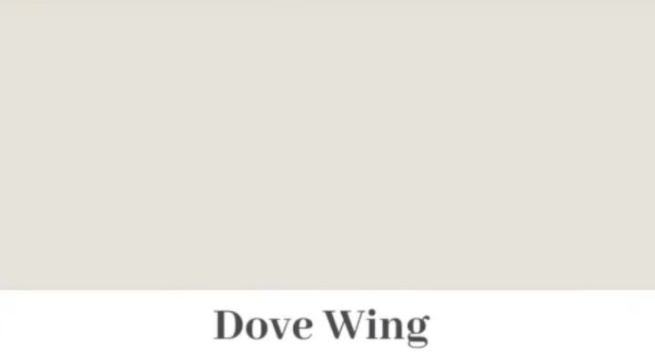
Dove Wing
Dove Wing is the darkest white I'm sharing with you, and it has a little gray in it and a little yellow in it, so it's a little darker.
When choosing your trim colors, hold them up against the paint you want to use. Look at it on your floors and if you're painting in a kitchen, be sure to hold it up to your cabinets and countertops, and then you can choose your white perfectly.
Benjamin Moore paint colors
That completes my list of favorite Benjamin Moore paint colors. What color is your favorite? Share in the comments below.


Comments
Join the conversation