11 Tips For Paint Color Selection From an Interior Designer

One of the most requested topics is our favorite paint color selections. Some elements are more important to understand than just the paint color. We’ll dive in for a deeper look at how to select paint colors for your home.
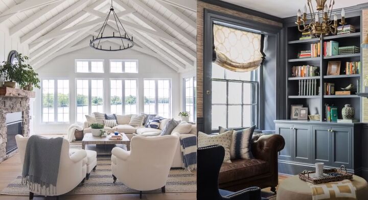
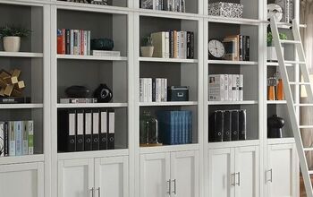
Paint color selection
1. How will the room be used?
Decide how the room will be used, what time of day it gets used the most, and what you want the mood of the room to be. For example, you might want an energetic color for a home office, not a soothing, relaxing color as you would for a bedroom.
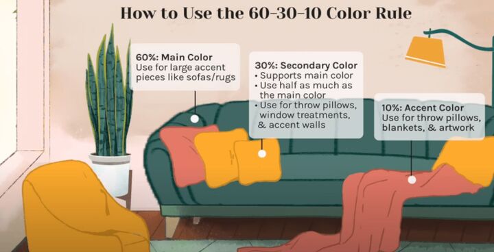
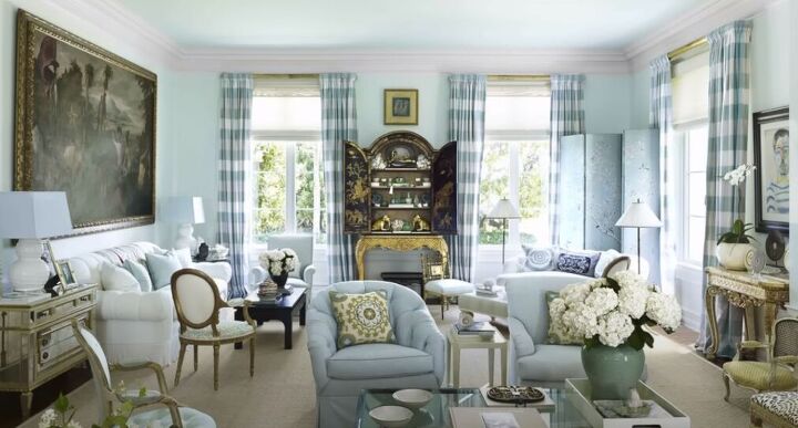
2. The 60-30-10 rule
This means that 60 percent of the room will be a dominant color, 30 percent will be a secondary supporting color, and 10 percent will be an unexpected accent color so the room pops with life.
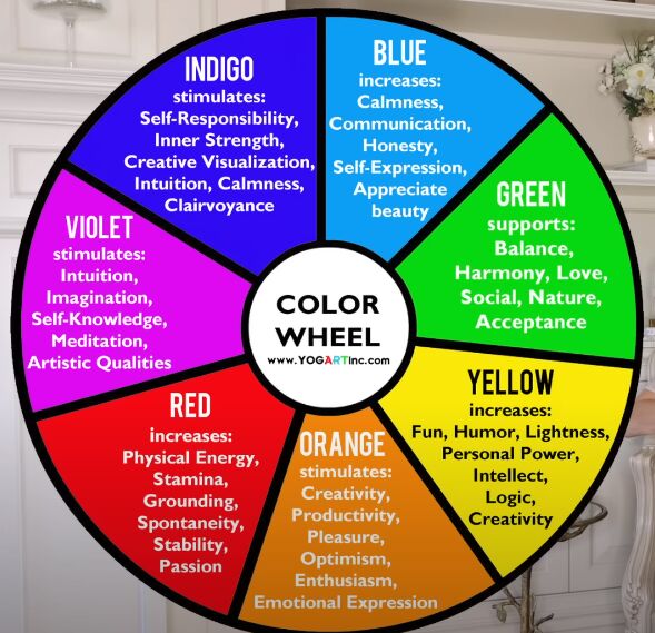
3. Understand a color’s energy
All color has an energy that it brings to the room.
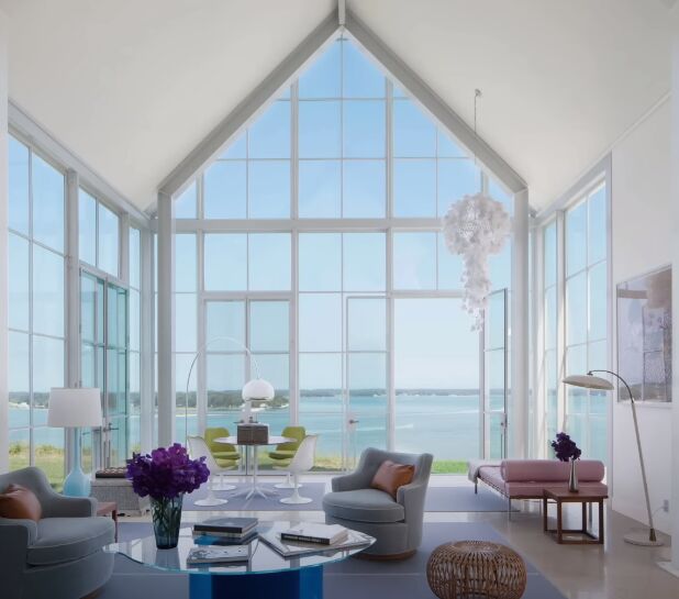
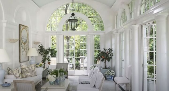
White
Think of white, which can be sterile, pure, and cold, or a hospital room. To add warmth to that, we can bring in the warmth of wood or textures, such as rattan or chunky wool blankets.
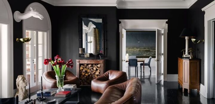
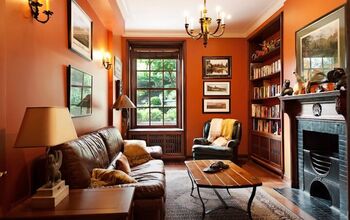
Black
Think of black, which is overpowering, dark, and heavy. Bring in the luminosity of wood and we have a beautiful, rich, and warm color.
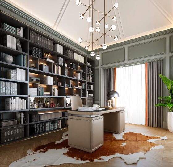
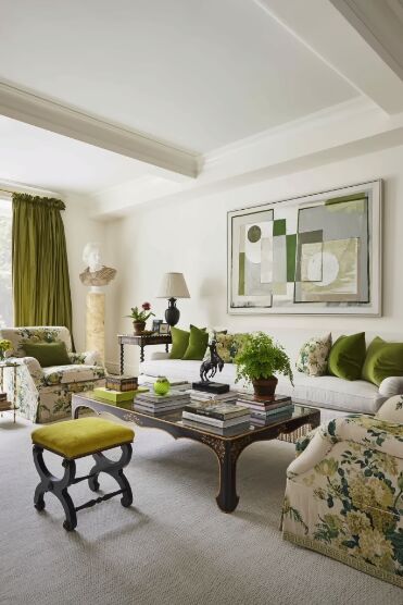
Green
Green is vibrant and associated with nature. Green is a great color choice for an office because it evokes new life and new ideas.
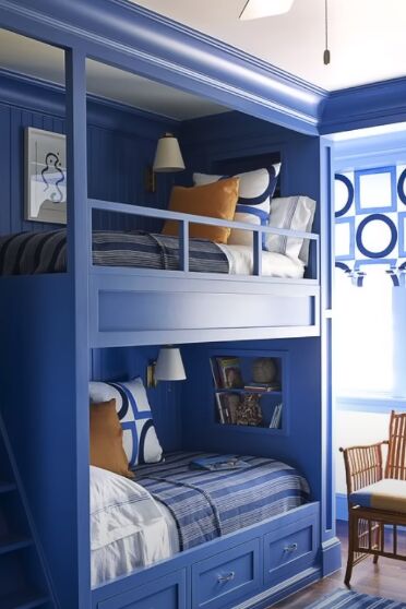
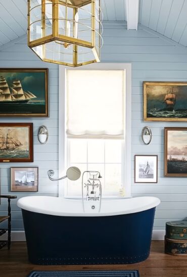
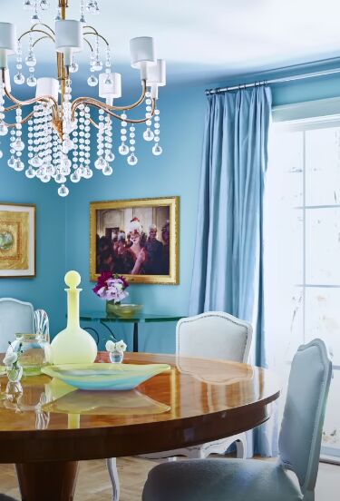
Blue
Blue is calming because we associate it with the sea and the sky.
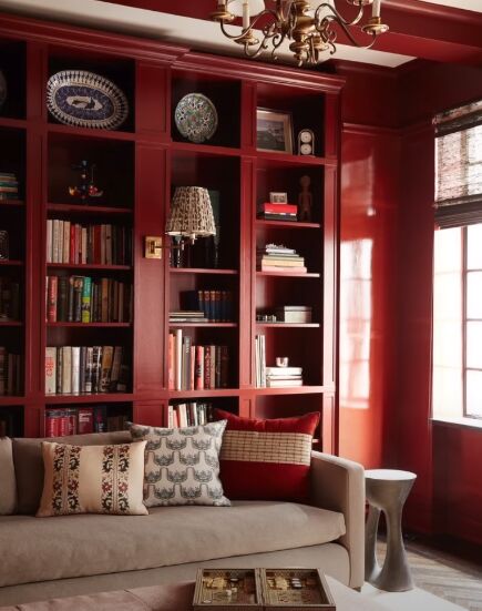
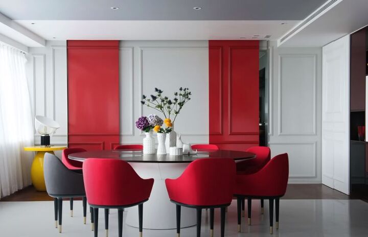
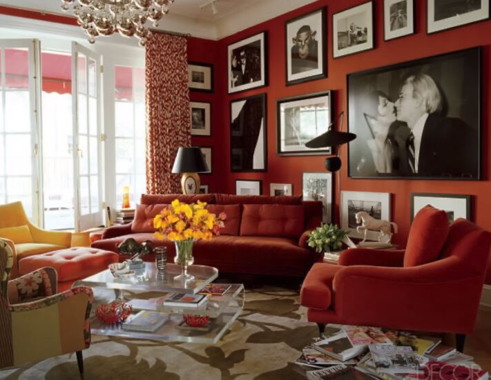
Red
Red is associated with restaurants because it speeds up the body and the brain.
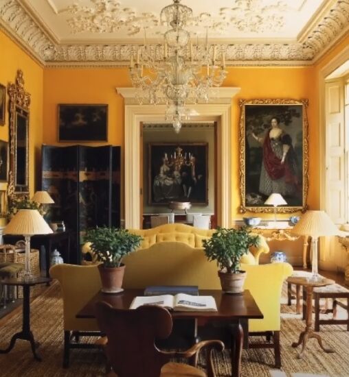
Yellow
Yellow is energetic, but sometimes too much depending on the room’s function.
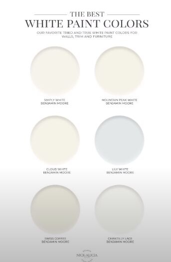
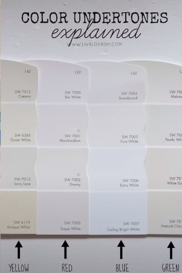
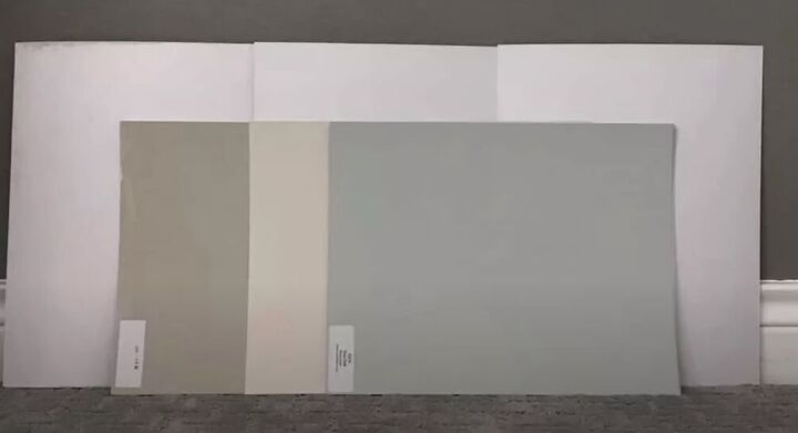
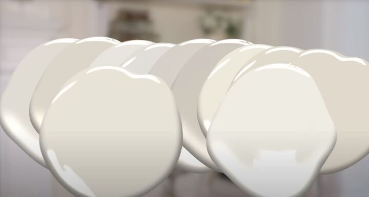
4. Undertones
There are undertones to colors. This is a very difficult concept to grasp.
The easiest way to see a color’s undertone is to compare a series of white paint colors against the whitest white in a paint color fan deck. Against pure white, you’ll see instantly whether a paint color is pure white, or if it’s been blended to make cream, ivory, or another white shade.
Using this same technique against a true primary color can help you determine what secrets (undertone) your paint color is hiding.
Warm paint colors will have a pink, beige, or yellow undertone. Cool colors evoke water and will have a blue, green, or purple undertone.
5. Natural lighting
The amount of natural light coming into a room also affects color. South-facing windows offer warm lighting and north-facing windows bring in cooler lighting. In addition, natural lighting varies depending on where you live in a country.
Color looks different during the day when reflecting natural light and at night when the color reflects artificial light.
6. How color reflects light
Lighter colors reflect more light versus saturated colors that absorb more light.
7. Test samples
The very best way to test colors is to put multiple 2-foot by 2-foot samples up on different walls in the same room. Put a large border of white paper behind the sample to block out the existing wall color.
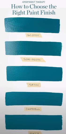
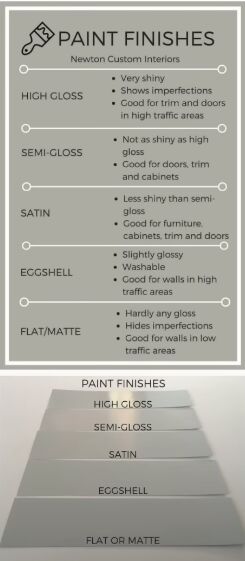
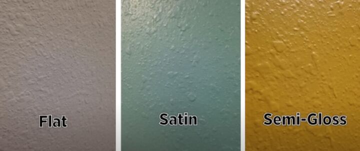
8. Finishes
The paint finish also affects how the color looks. A higher-shine paint color reads darker than flat paint. Higher-shine paints also reflect more light and will show more imperfections than flat paint. Don’t use high-shine paint on imperfect walls or it’ll show every bump and dimple.
9. Consider the ceiling
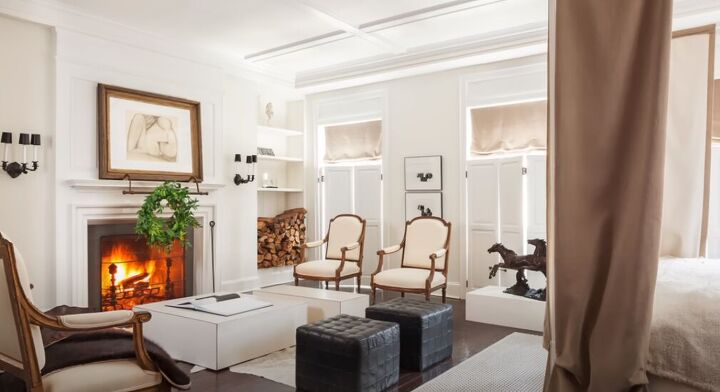
I rarely use white ceilings unless the walls are white.
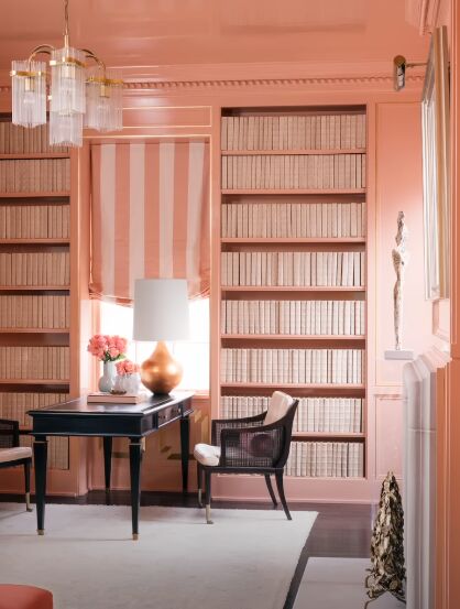
A color on the ceiling pushes it up rather than creating a contrast that lowers the ceiling. I also like to use the same color on the trim, crown molding, and baseboards. This gives the space an expansive, luxurious look.
My paint sheen formula
Use a high-quality washable flat on the walls and ceiling, a washable semi-gloss on the trim, and satin on wainscoting and crown moldings.
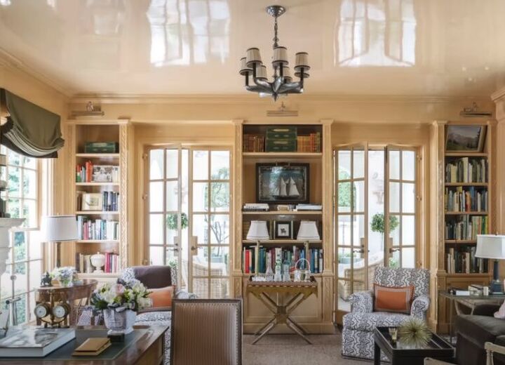
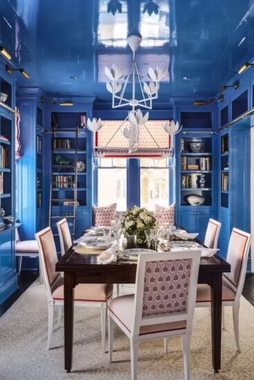
I sometimes use a high lacquer shine on a ceiling to create drama.
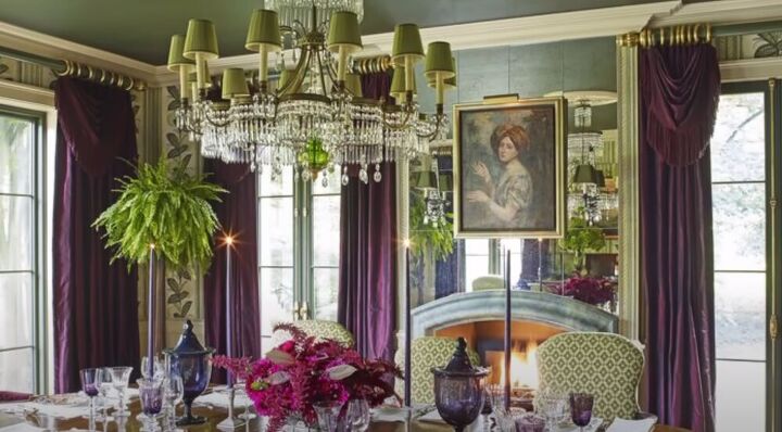
10. Fall in love with a color
Find a carpet, fabric, or artwork that you fall in love with to select the room’s color scheme. What if you fall in love with a piece of art that has a lot of red in it but don’t want a red room?
Take different shades of red so it’s not so overpowering. It’ll be soothing and relaxing since there’s no contrast.
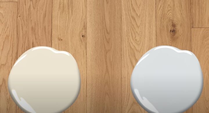
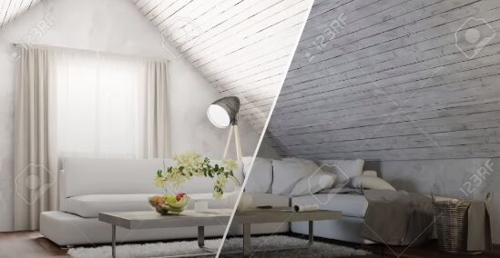
11. Bring flooring along
Always have a flooring sample on hand when choosing a color to make sure they work together. An opposing paint undertone will make the floor’s undertone stand out more (like the right side of the image).
My favorite paint colors
I use OC 22 Calm by Benjamin Moore most often. It’s a neutral, warm color that reads as white on the walls without being stark and cold. Some of my other favorite colors are anywhere from OC 17 (a yellow-based white), OC 18, and OC 23 to OC 31.
Paint color selection
I don’t want people to remember the color of a room or house. I want them to remember the feeling they had instead. Please let me know in the comments if you found today’s information valuable and helpful for your paint color selection.


Comments
Join the conversation