6 Basic Interior Design Color Combinations You Need to Know

Have you ever felt overwhelmed when you had to pick color combinations for your home? I will help you understand interior design color combinations and what makes sense for you.
Colors determine the mood of a space and how you feel in a room. A color scheme is a careful selection of the best color combinations that will create an aesthetically pleasing space.
It’s usually easier to select a single color but selecting a combination of colors is usually not so easy to pull off. I’ll show you how to choose the best color combinations like a pro.
Interior design color combinations
Know the basics of color
There are primary, secondary, and tertiary colors.
Primary colors
Primary colors are natural colors that cannot be made by combining any other colors. These primary colors are blue, red, and yellow.
Secondary colors
Secondary colors are colors obtained by mixing primary colors. These secondary colors are green, orange, and purple.
Tertiary colors
Tertiary colors are colors obtained by mixing primary and secondary colors, and these are limitless.
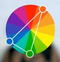
There are six ways to combine any colors you love to create an amazing and beautiful space. You can’t go wrong with any of these. I will also refer to the color wheel.

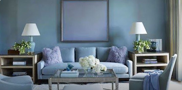
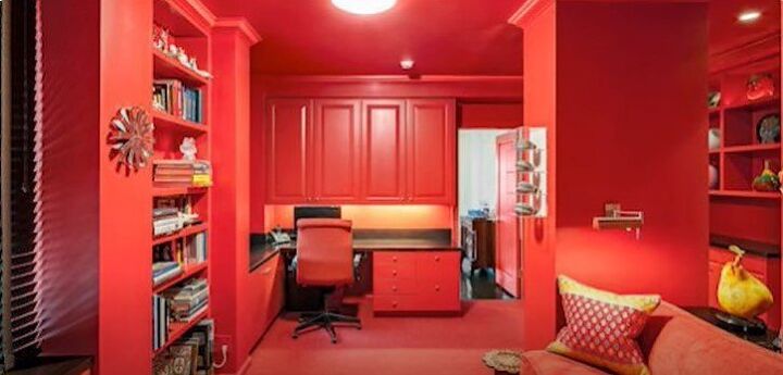
1. Monochromatic color scheme
This is the simplest and easiest color scheme to take on. Select a particular color and use the tints, shades, and tones of the same color in one space.
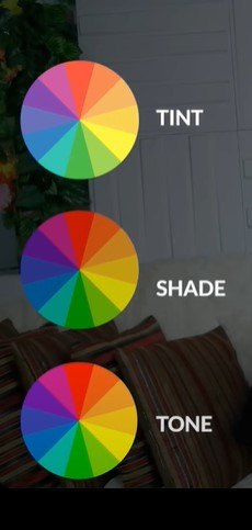
What are tints, shades, and tones?
A tint is when you add white to a color. A shade is when you add black to a color. A tone is when you add a little gray to the color to make it less vibrant.
A monochromatic scheme creates unity and makes your space cohesive. It works best when you add patterns and textures to your design.
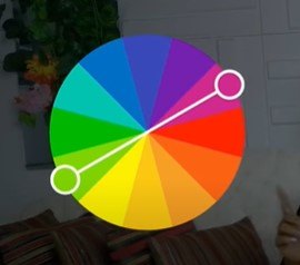
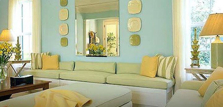
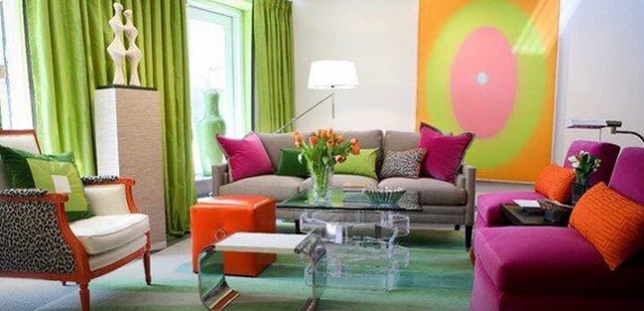
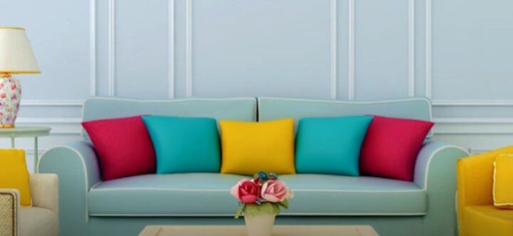
2. Complementary color scheme
Select only two colors from the color wheel but opposite of each other. Select the color you love and the color opposite of that one. Colors can be spread out equally in the same space or select one as a dominant color and the other as an accent.
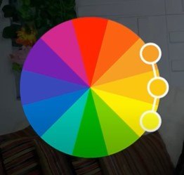
3. Analogous color scheme
Select three colors that follow each other on the color wheel. They are likely to look alike and flow seamlessly in a room. It’s best not to spread these colors evenly. Select a primary color and make an accent of the other two colors.
60-30-10 rule
You can incorporate the 60-30-10 rule in design using an analogous color scheme. So, 60 percent of the room should be your dominant color, 30 percent should be the secondary color or texture and 10 percent should be the third color used as an accent.
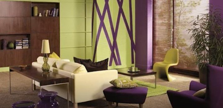
4. Triadic color scheme
This scheme also involves three colors equally spaced from one another on the color wheel. This scheme provides a strong contrast of colors in a room.
At first, it may look like an unlikely color scheme that wouldn’t work in a space. But when you put them together, it’s amazing, and the colors pop.


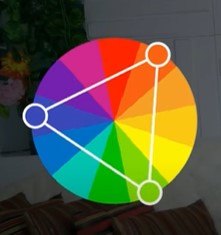
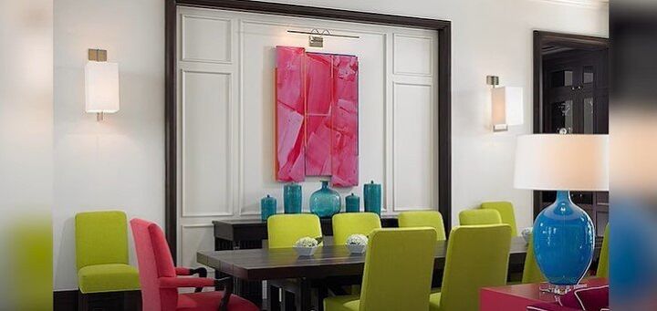
5. Split complementary color scheme
This is a variation of the complementary color scheme. Instead of using two colors, you use three colors, again. Select a primary color and two other colors.
Combine it with the two colors that sit directly adjacent to the complementary color without choosing the complementary color itself. This is a complex and heavily contrasted scheme and you will need some confidence to pull it off.
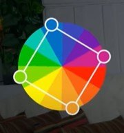
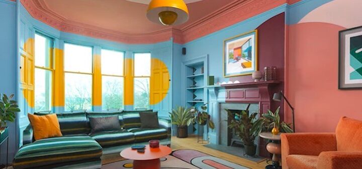
6. Tetradic color scheme
This is the most creative and contrasting color scheme. It involves two sets of complementary colors. It is also called a rectangle selection because it creates a kind of rectangular form on the color wheel.
If it’s not properly mixed, it can be chaotic, especially when the colors are equally applied. To be safe with this color scheme, choose a dominant color and let the other colors act as accents.
Interior design color combinations
Now that you know these six color schemes, you will be more aware of all the color combinations around you. We combine colors every day for our outfits and even our makeup, and we can learn to do it well in our homes, too.
Let me know in the comments your favorite interior design color combinations and what you have used in your home.


Comments
Join the conversation