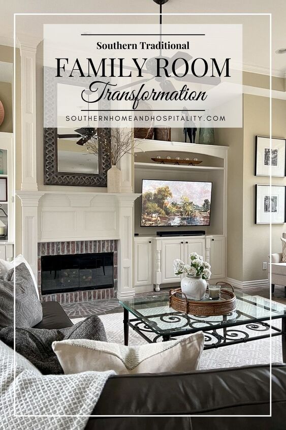
Southern Traditional Family Room Transformation
At the very top of our priority list when we moved into our traditional southern fixer-upper was to remodel the kitchen and family room to make them even usable. Call us crazy but we loved this house enough to see past what it looked like the first time we saw it. And a cosmetic facelift was definitely in order to say the least. We hardly had anyone over to the house in the first few months before this remodel…it was just too embarrassing! It was shocking to see the interior after driving up to its beautiful facade. There was so much weirdness inside.
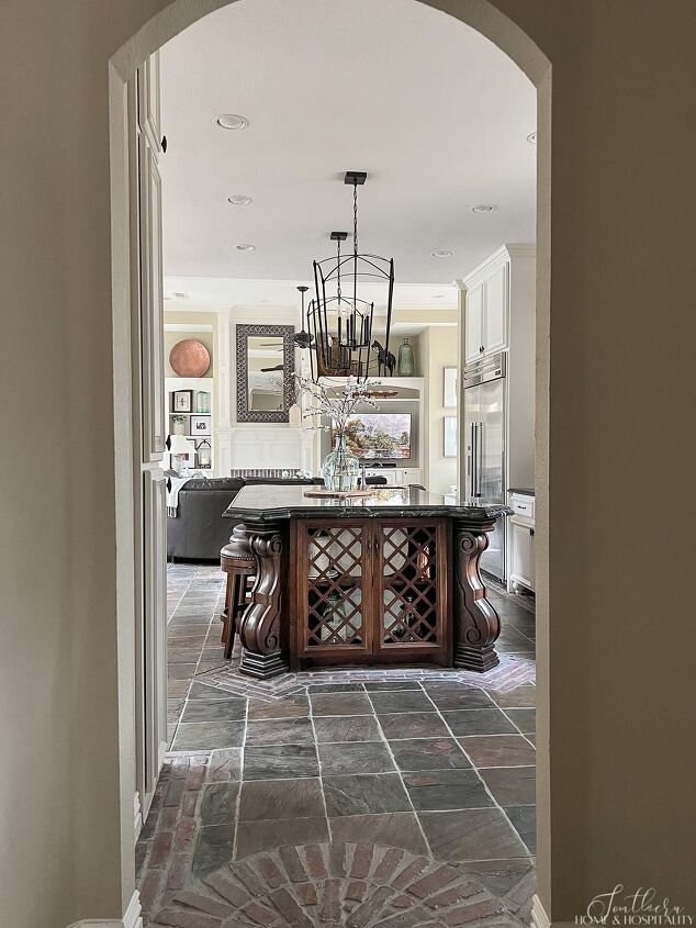
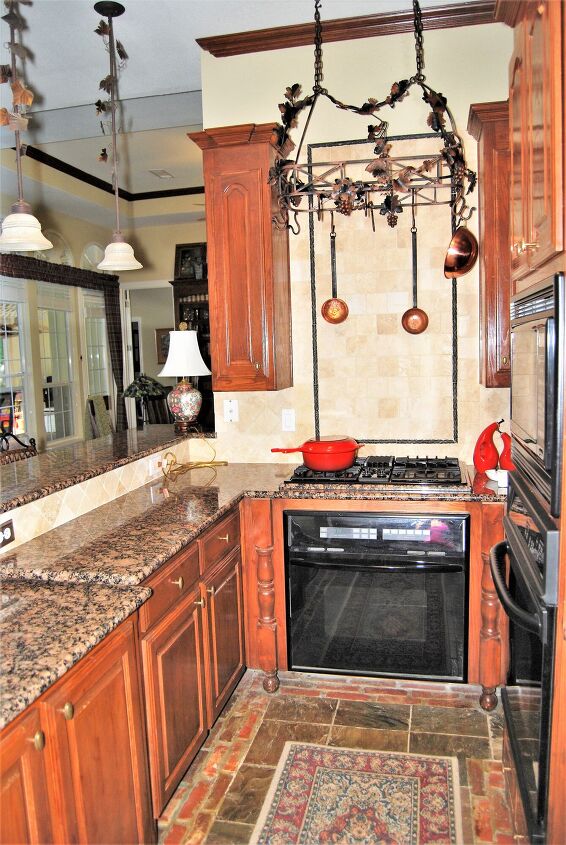
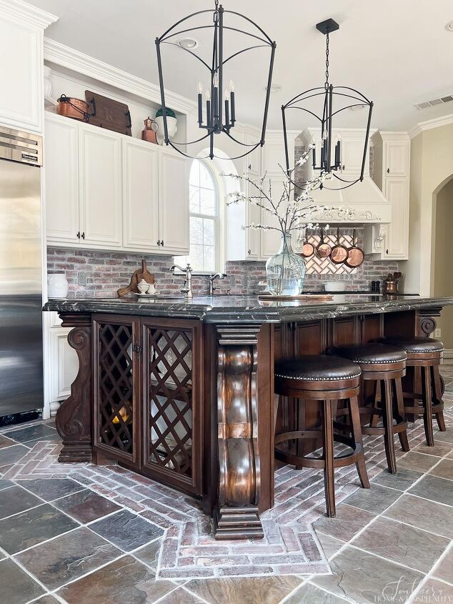
If you’ve been here before you know I love French country, but the original outdated French country theme was a bit, ahem… tacky. And the space layout itself was just so strange, where forcing lots of vintage-style ideas into the room took over good plain common sense. The adjoining kitchen was equally bizarre but is now one of my favorite rooms with its modern French country makeover. The two rooms were renovated at the same time, becoming one large area.
The plan for the family room makeover was actually mostly cosmetic…more so than the kitchen. It was not in the budget to gut the space and start over considering everything we had to do to this house. And there were features that we did like when we looked past the awfulness and separated them in our mind.
The family room also needed to flow with the kitchen since it would now be one area, and also with the rest of the house. This was our goal for every room…to make each one fit seamlessly with the overall style and not sterilize the unique things that drew us to the house in the first place. In the end we hoped to have a home that was classic, traditional, full of vintage touches, and full of warmth, charm, and patina. (Minus some of the weirdness.)
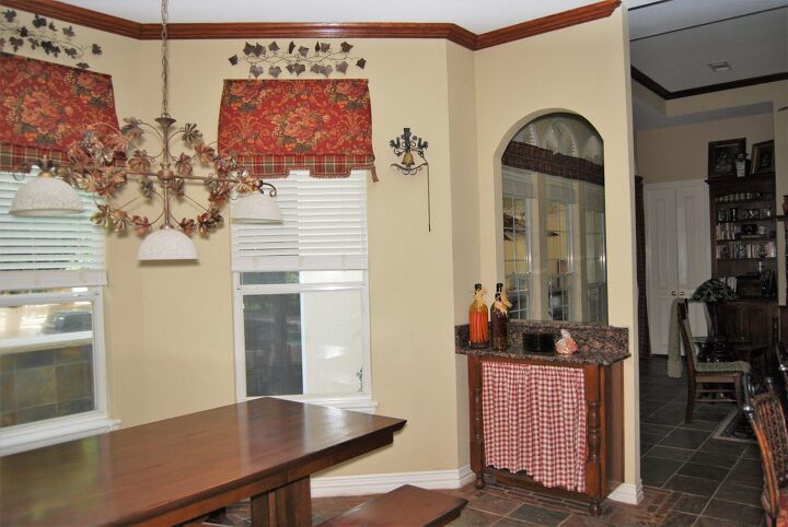
Are you ready for some “before” pictures? (I apologize for the quality…they were taken with an old IPhone whatever-it-was-seven-years-ago when we looked at the house.)
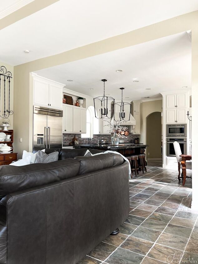
What had to go other than the profusion of ivy, grapes, and plaid? The biggest change came from opening up the kitchen and family room into one large space. Before, there were two partial walls that separated the kitchen and the den from each other, making the two spaces seem smaller:
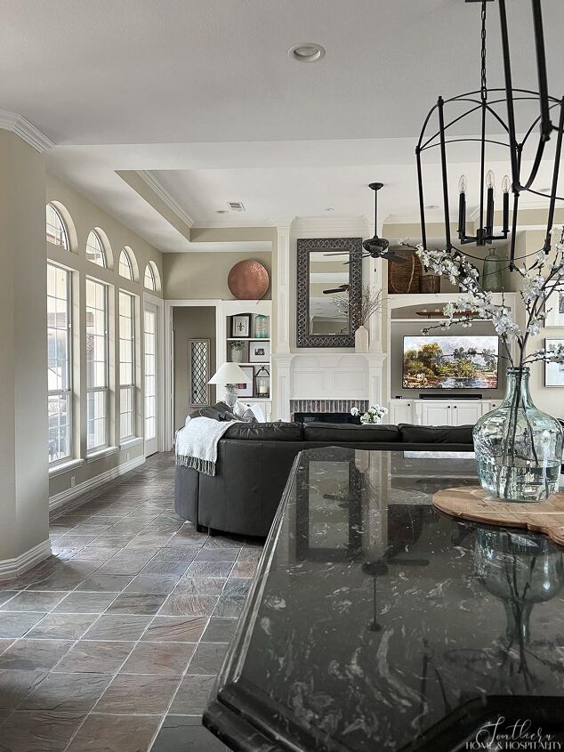
By taking out the arch opening wall on one side, and removing the wall with the range on the other side, the rooms are no longer cramped and closed off. It is so much more bright and open now!
In order to take out the walls, we had to have a header support beam put in that runs the width of the kitchen. You would never know the majority of our budget for our family room makeover went into this area of the ceiling:
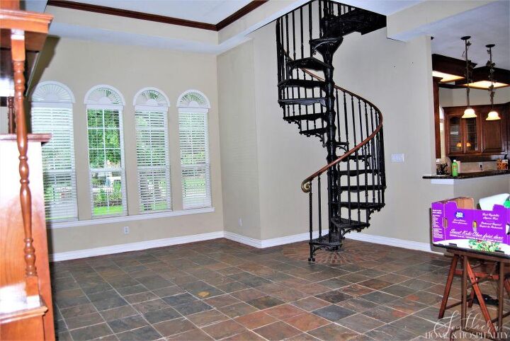
One of the features that was forced into this room without enough space to accommodate it was a Victorian iron spiral staircase that took up way too much of the floor real estate. And look at how ridiculously crammed the small scale sofa (previous owner’s contents) and coffee table are to the fireplace in a room this size! If you wanted the seating to face the television and fireplace there was no other option.
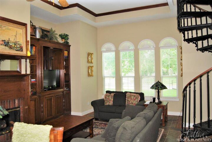
We had the main staircase one room over so this one wasn’t essential. On its own I actually liked it. It reminded me of something you would see in New Orleans. But not only did it not fit, a spiral staircase seems dated in a family room. But because it was nice, we were actually able to sell it. You never know what people will buy on FBMP!
After the renovation, you would never know it was there. It was located where this hutch is. And now the sofa can be placed at an appropriate distance from the fireplace.
The original mantel design still leaves me speechless. Vintage inspired? Yes. Ugly? YES!!!
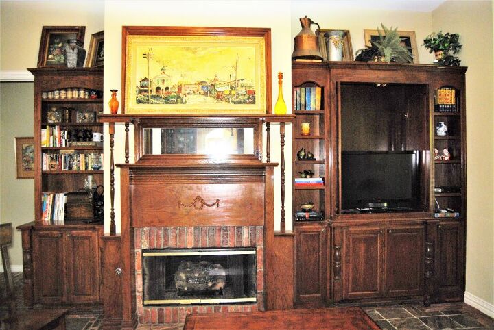
I wish I knew what the intention for this frame was. That is actually an extension of the mantel, not just a frame that is propped on top. My guess would have been to frame a TV, except that’s a TV cabinet on the right.
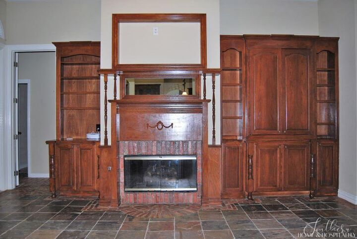
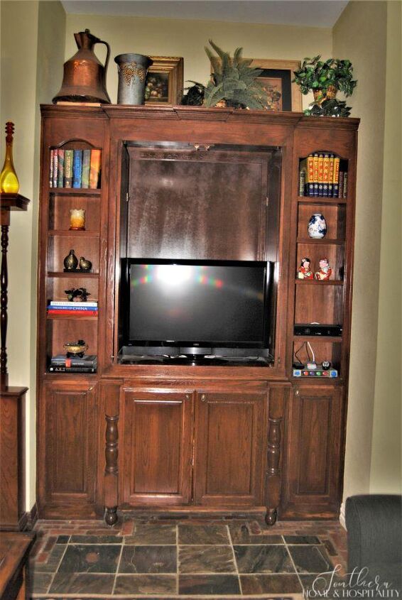
I would have loved having a built-in to hide the television in the 80’s and 90’s. But this size TV doesn’t cut it with our family anymore. The very first thing my husband did before we even moved in was take a saw to the top of this cabinet so that we could set our TV there until our remodel. You can tell where his priorities are!
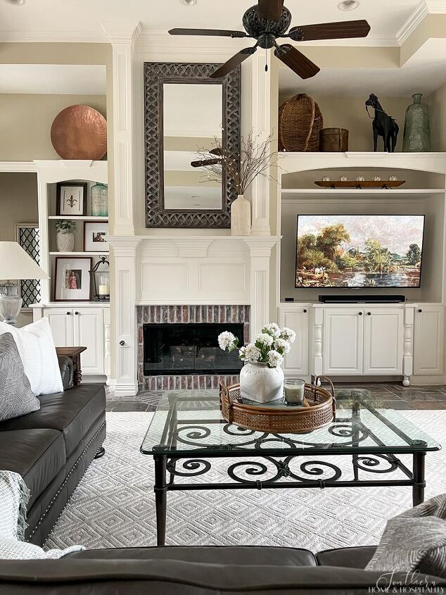
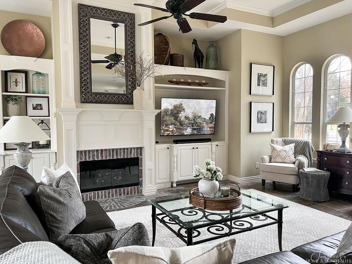
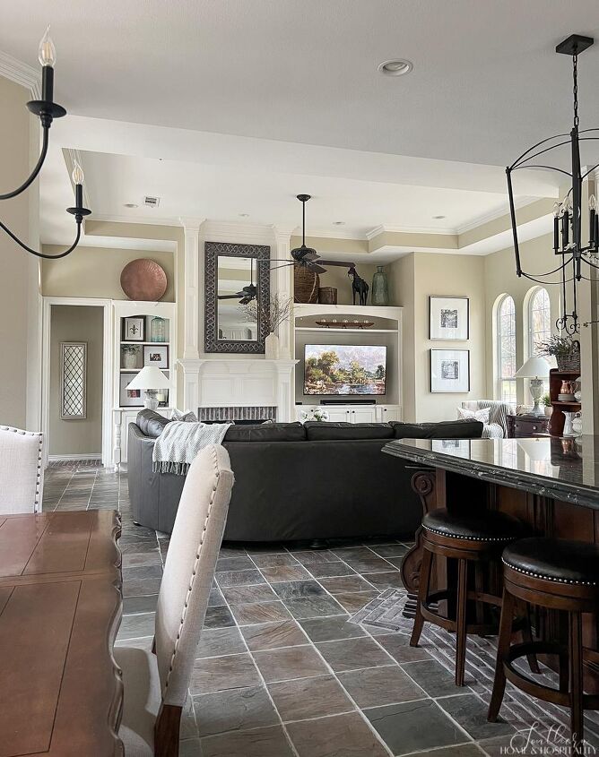
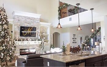
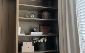
Let’s look at the built-ins now after their refresh…
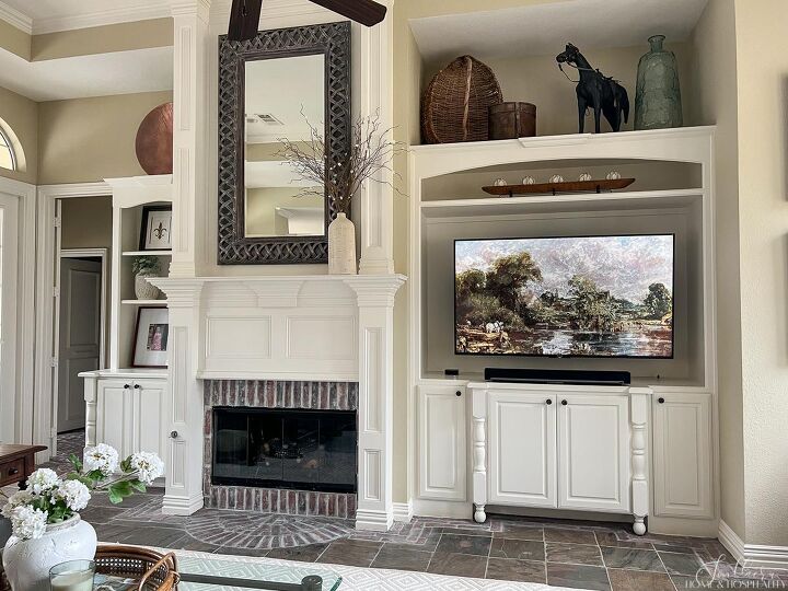
We liked that the built-ins were the focal point of the family room, so we wanted to leave them in place but we made a few modifications.
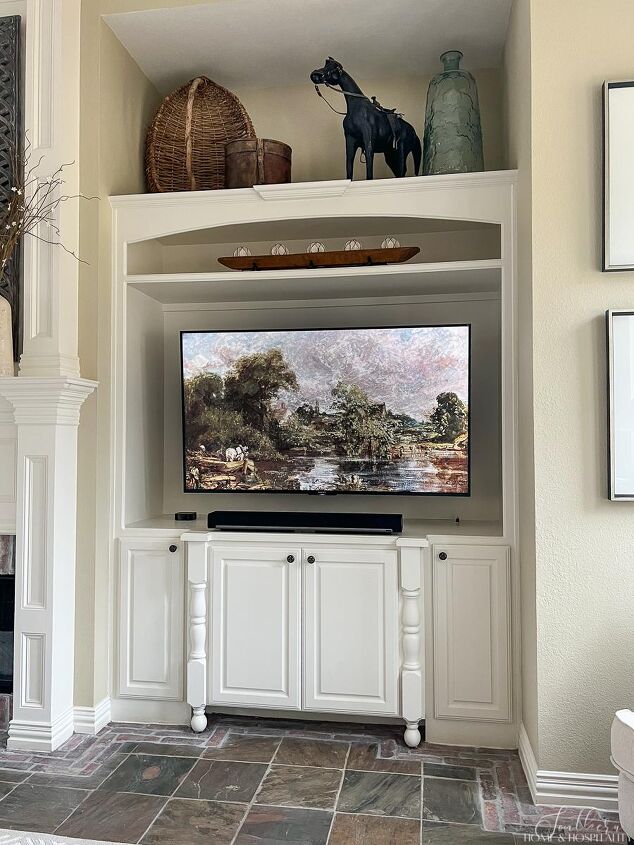
The bottom cabinets of the tv section stayed in place. We had the top modified to hold a large flat screen with a shelf above for decor or electronics. We had the carpenter copy the arch and top molding from the left side built-in.
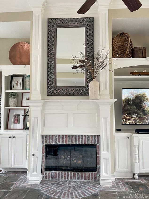
The carpenter replaced the strange mantel monstrosity with this traditional style more fitting to the house and built it all the way up to the 12-foot ceiling. The brick surround is actually still the same although it looks somewhat different after some sanding and Grout Renew. And a little black paint on the fireplace cover made the outdated brass disappear.
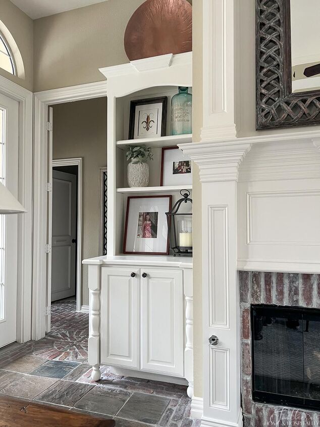
This side of the built-in was actually not modified at all. It just got the same paint as the rest of the cabinets and trim and some new knobs. I removed some of the shelves…they were too close together and only suited for small items which looks too cluttered in my opinion.
I’ve talked about the things we changed that we did not like about the room. Now let me share what we did like!
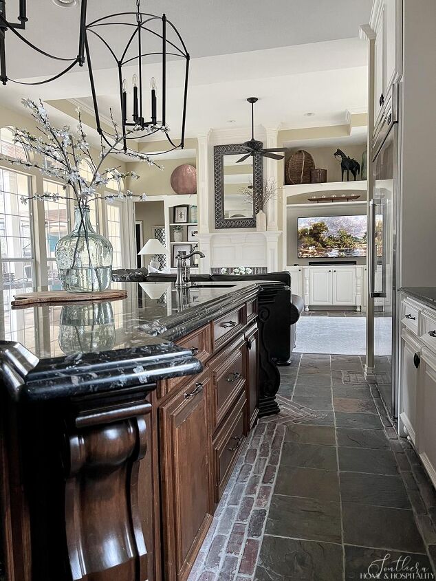
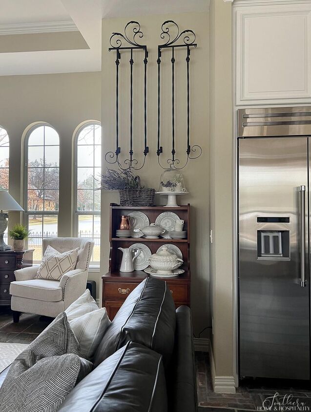
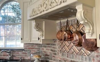
The floors throughout the kitchen and den are slate outlined with brick. We like how easy slate is for daily use, especially with a pool. I also like its rustic look. It offsets some of the more formal and feminine features in the house. But I have a nostalgic soft spot for BRICK!! You’ll see it a lot in Louisiana indoor architecture and I love its casual, rustic feel. This is one of the unique features of this home that got me. I even brought it up onto the backsplash in the kitchen remodel, using the extra that was stored in the attic.
We were able to patch the slate and brick where the walls were removed and copy the brick pattern surrounding the room where needed. The existing floors needed a little TLC. They were covered in a yellowed glossy sealer that you may notice in the before photos. It even made the brick around the fireplace glossy.
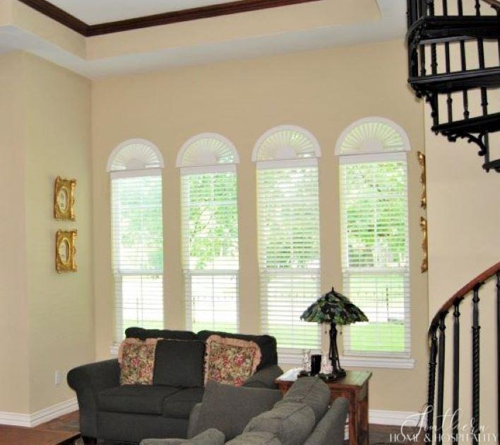
I also liked that the room already had crown molding lining a tray ceiling. It just needed a paint job and a new ceiling fan. No picture of the old fan with its grape motif but trust me, it was hideous. We also added recessed lights to the family room and kitchen area.
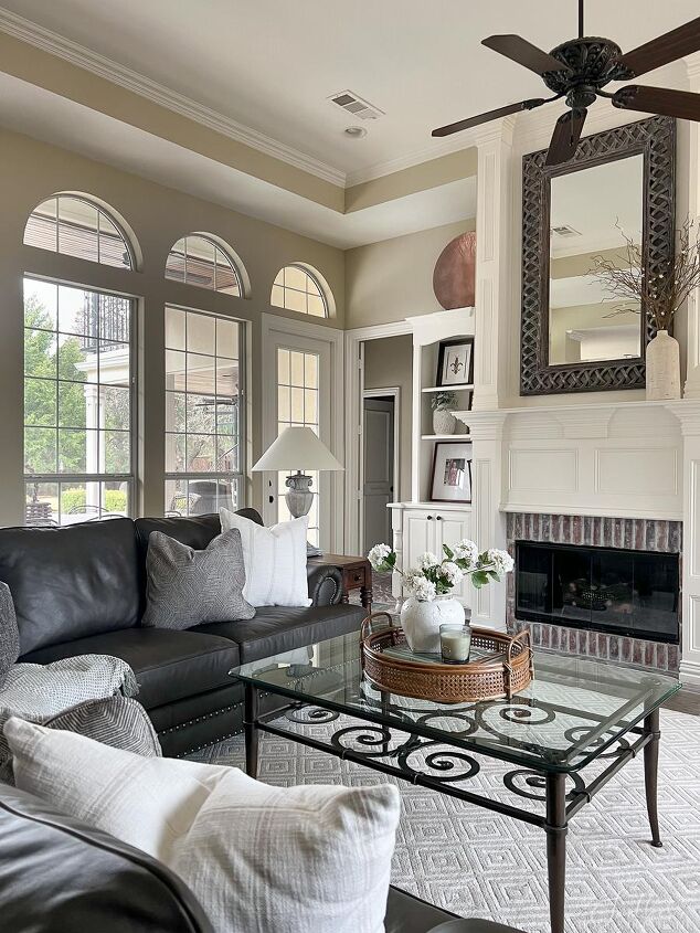
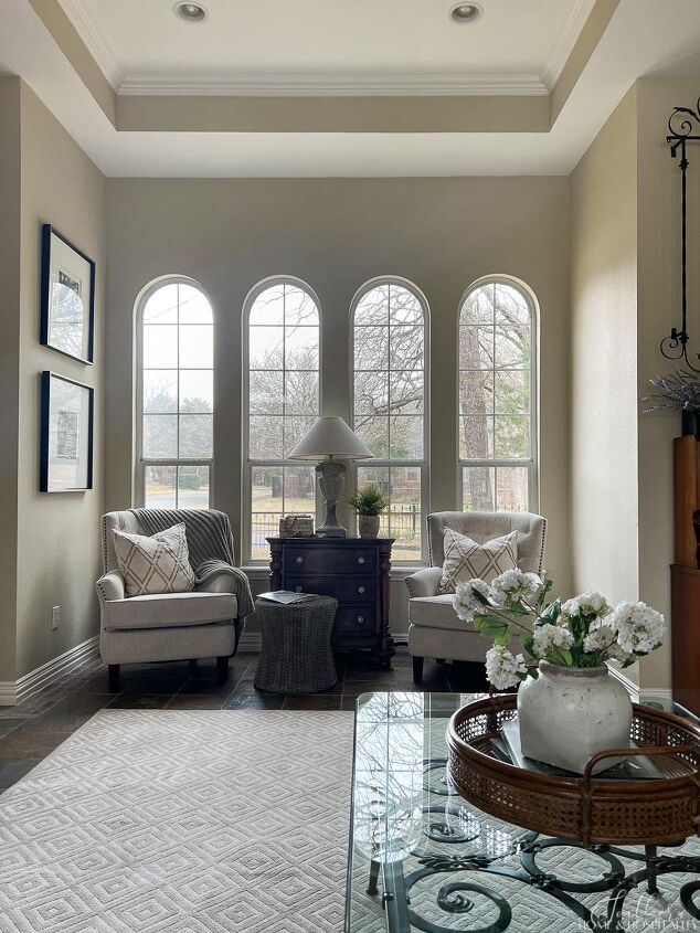
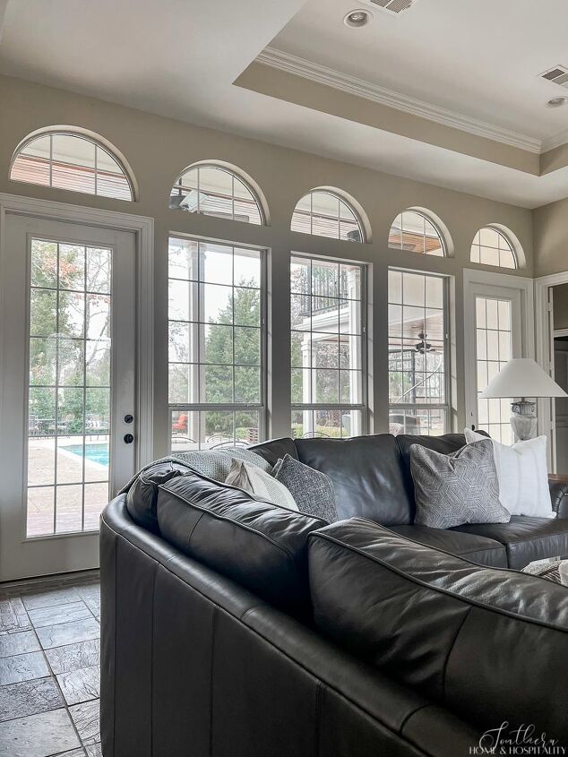
The other thing that I liked about this original room was the number of windows on both sides. Lots of natural light in my rooms makes me so happy!
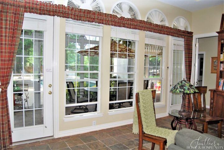
We removed the blinds to paint and decided not to put them back up. We don’t get direct sun into the room, so not even the arch shutters are really needed. The room feels larger and taller without them.
I love looking back at where this family room started and the transformation it underwent. I’m so glad we could see past what was here before and make it into a comfortable, usable, yet still unique space for our family to hang out in.
Thanks for coming in for the tour…be sure to check out how we came to buy this house, our kitchen transformation, and also check back for future posts for our other room makeovers!

As always, I appreciate your visit, comments, and shares here! And don’t forget to subscribe for updates to keep in touch and to follow along with me on Pinterest, Instagram, and Facebook!!
Remember to pin this to your Pinterest Family Room board to refer to later. You can FOLLOW ME ON PINTEREST and see all of my pins plus lots of other inspiring ones that I’ve found and pinned!
Pin this for reference later:
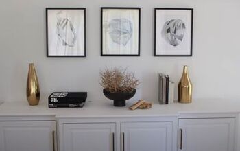
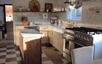
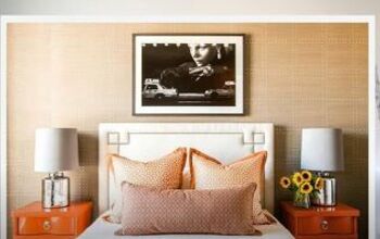
You might also like…


Comments
Join the conversation
I loved your updates on your home. I would have done the same thing to open up the rooms. My home is similar, but I white washed the brick , which gave our living room more brightness. Great job! I’ll keep following for more ideas!
Kudos!!! I love every detail of your home!
Enjoy!